
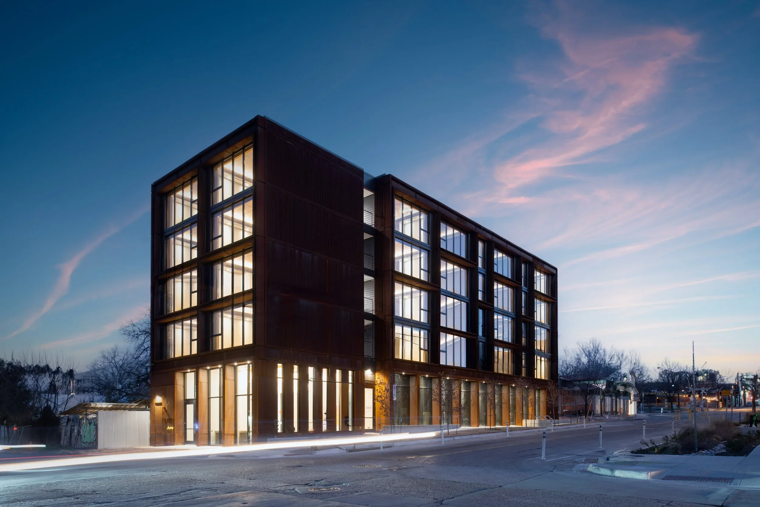
How I photographed Juno East Austin, the city's first mass timber apartment building, designed by Ennead and published in Architectural Record and ArchDaily.
Read More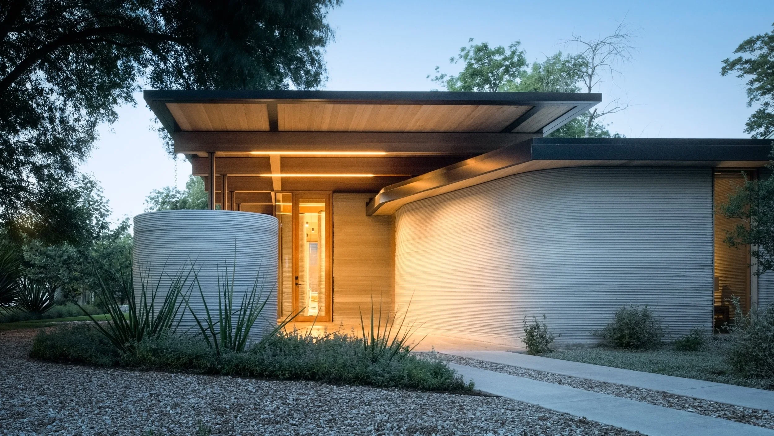
How Architectural Photography Supports AIA Award Submissions
Strong photography is one of the single biggest variables in whether an AIA submission advances. Award juries review hundreds of entries on tight schedules -- often in a single sitting -- and the projects that move forward almost always lead with clear, well-composed, professionally photographed images. Good architecture loses to bad photography routinely. The submissions that win are the ones where the photography lets the jury see the work the way the firm intended.
Why does photography matter so much in AIA submissions?
Because the jury isn't visiting your project. They're seeing photographs of it.
That single fact reshapes the entire calculus. The building you designed, the spaces you proportioned, the materials you specified -- none of that exists in the room with the jury. What exists is a sequence of images, usually viewed at screen size, often in rapid succession alongside dozens of other entries. Whatever the images convey is what the jury knows about the project.
This is different from a client meeting or a site visit, where you can guide attention, explain decisions, and let the building speak for itself in three dimensions. In a submission, the photography is the building. And it's not the photography alone -- it's the photography paired with the captions, the project narrative, and the supporting drawings. But the images set the entire register. They tell the jury what kind of project this is, what kind of firm produced it, and how seriously to evaluate the work.
A jury reviewing a submission can tell within seconds whether the photography is professional or not. That judgment is unconscious and almost immediate. Once it's been made, it shapes how every subsequent piece of the submission is received.
What kind of photography do AIA juries actually respond to?
Clear, composed, and honest images that show the work as it was designed.
The keyword is honest. AIA juries -- particularly at chapter, state, and national levels -- are typically composed of practicing architects who can tell when photography is masking a project rather than documenting it. Over-stylized images, heavy compositing, exaggerated wide angles, or aggressive HDR processing tends to read as a tell. The jury starts looking for what's being hidden rather than what's being shown.
The strongest submissions feel like the photographer was a quiet observer documenting what the architect did. Clean horizontal and vertical lines. Natural light handled carefully. Materials rendered the way they actually look. Spaces shown at proportions that match how they're experienced rather than distorted to look more dramatic.
Beyond technical quality, juries respond to images that explain something specific about the project. A shot that shows how a stair lands in a room and resolves the section. A view that demonstrates the relationship between two materials at a critical detail. An exterior angle that reveals how the building meets its site. Each image should be doing work -- communicating an idea about the project, not just being a beautiful picture.
The submissions that advance tend to have 8-12 images where every single one earns its place. The submissions that don't advance tend to have the same number of images, but only 3-4 are working hard and the rest are filler.
How does a strong photography set change the outcome of a submission?
It shifts what the jury is evaluating.
When the photography is weak, the jury is evaluating the photography -- consciously or not. They're trying to read past the images to understand what the project actually is. That cognitive friction works against the submission no matter how strong the underlying work is. Jurors aren't paid to do detective work. If the images don't make the case, the submission falls into the maybe pile, then out.
When the photography is strong, the jury is evaluating the architecture. The images become invisible -- a transparent window onto the building. Now the conversation is about the project on its own merits: the parti, the resolution, the response to site and program, the craft. That's the conversation you want.
This shift is the entire return on investment for award photography. It's not about making the project look better than it is. It's about removing the friction that prevents the jury from seeing the project clearly.
Firms that win awards consistently know this. They invest in photography because they know it's the variable that determines whether the work is evaluated fairly. Firms that submit year after year without advancing often have excellent projects but photography that's working against them.
What specific images should a submission include?
The composition of an award submission image set depends on the program and project type, but the categories are consistent.
One hero image. Usually exterior, often twilight. This is the lead image that sets the entire tone. It's the image the jury sees first and the one they remember. It needs to be unambiguously strong -- clear about what the project is, beautifully composed, technically clean. If only one image lands, this is the one.
Two to three context shots. These establish where the building sits -- relationship to site, neighborhood, landscape, or urban context. They help the jury understand the project's situation before evaluating its details.
Three to five interior images. These should show the most important spaces in the project, photographed at angles that explain the design intent. Not every room. The spaces that demonstrate what makes the project worth recognizing.
Two to four detail or moment shots. Material transitions, key construction details, light conditions, or specific design moves that warrant close examination. These are the images that reward a jury member who's leaning in.
One or two diagram-supporting images. Photographs that, paired with drawings, help the jury read how the building works. A view down a corridor that reveals the section. An exterior that shows how the mass resolves. These are often more useful than they look.
The total is usually 12-18 images for most categories. Some programs allow more, but more isn't better. Every additional image dilutes the strongest ones.
What should the photography emphasize for different AIA award categories?
The category shapes the priority.
Honor Awards (general design excellence). Lead with the parti and the experience. The images should let the jury understand what's distinctive about the project as a piece of architecture. Hero exterior plus interior sequence is the standard structure.
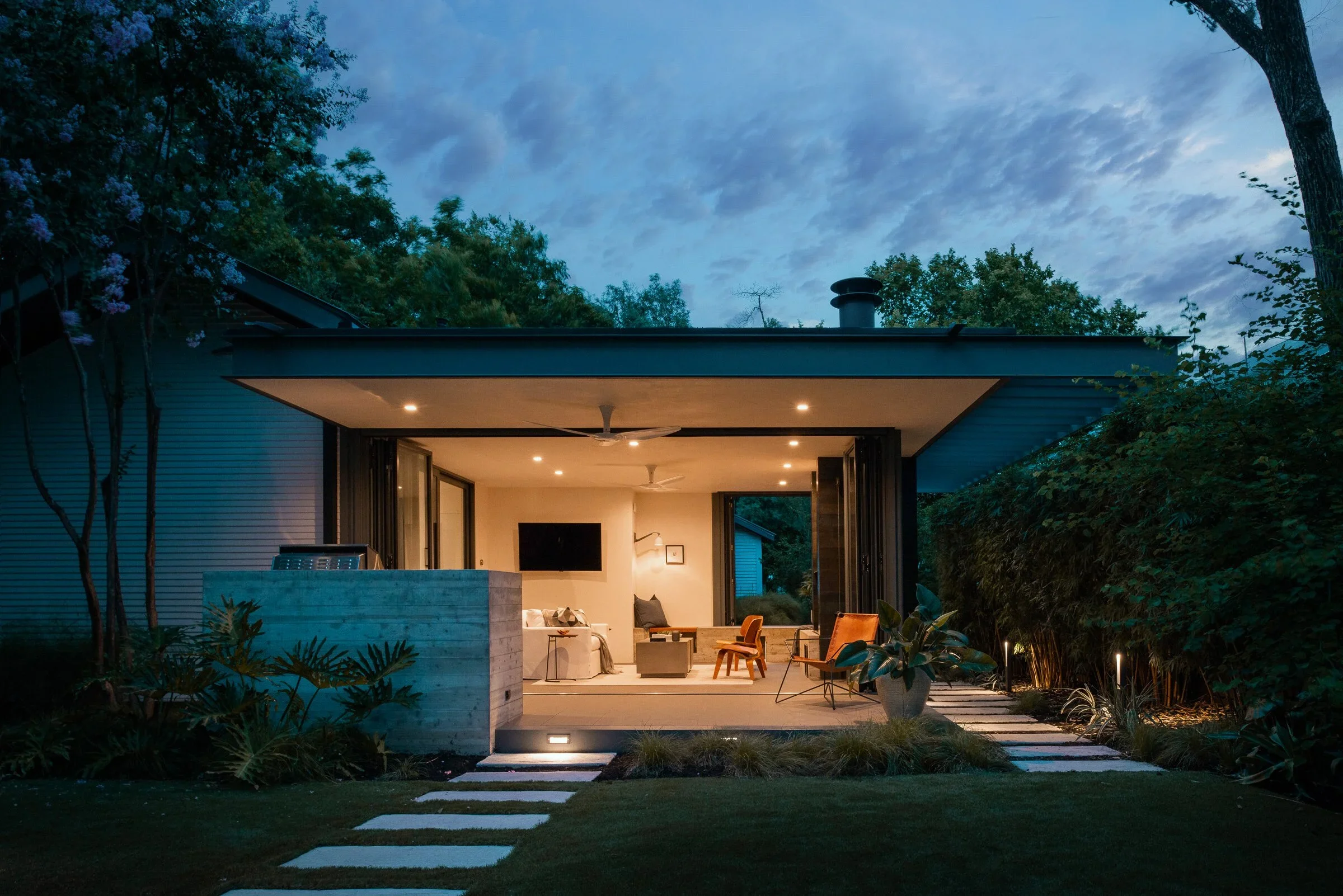
Housing or Residential Awards. Domestic experience matters. Show how the house is lived in, how spaces flow, how the design supports daily life. Twilight images often perform especially well here because they convey occupancy and warmth.
Interior Architecture Awards. Material and detail dominate. The submission should be heavy on close-range interior work with careful attention to how surfaces, light, and proportion come together. Hero shots are often interior here rather than exterior.
Adaptive Reuse or Historic Preservation Awards. Before-and-after comparisons matter, even if the before is documented in lower-quality archival images. The submission needs to make the transformation legible.
Small Project Awards. Restraint and precision are the values. Tight composition, clean light, and an emphasis on how a small project punches above its scale.
Regional Awards (Texas Society of Architects, Austin AIA, etc.). Local context counts more here than at the national level. Showing how the project responds to climate, site, and regional culture often resonates with juries who know the area.
The photographer should be briefed on the category before the shoot if possible. The shot list can shift meaningfully based on what's being submitted to.
When during the project timeline should photography happen for awards?
Earlier than most firms plan for, but not so early that the project isn't ready.
Most AIA programs have submission deadlines in the fall or winter for the following year's awards cycle. That means projects completing in spring or summer have a natural window for photography before the deadline. Projects completing late in the year often miss the cycle or end up rushing the photography in ways that hurt the submission.
The right time to shoot is when the project is genuinely finished -- punch list complete, furnishings in place, landscape established, construction debris cleared. Shooting too early produces images full of unresolved details that hurt rather than help. Shooting too late means submitting with whatever photography happens to be available.
For award-track projects, I recommend planning photography 2-4 months before the earliest expected submission deadline. That gives time for post-production, time to evaluate the image set, and time to schedule a reshoot if anything critical is missing. A reshoot two weeks before deadline is stressful and expensive. A reshoot two months before deadline is just good planning.
If your firm consistently submits to multiple programs with different deadlines, build a photography calendar around your project pipeline. The firms that win awards regularly are usually the firms that treat photography as part of project completion rather than as an afterthought.
How do publication and award photography compare?
They overlap significantly but aren't identical.
Editorial photography for publications like Architectural Digest, Architectural Record, or Dwell tends to favor mood, narrative, and visual storytelling. Magazines need images that work in a magazine context -- wide shots that fill a spread, vertical compositions that match column layouts, moments that convey atmosphere alongside architecture.
Award photography emphasizes clarity, composition, and the legibility of design decisions. Juries don't need atmosphere as much as they need to understand what the project is. A perfect editorial image can sometimes be a weak award image if it prioritizes mood over information.
In practice, a well-planned shoot produces both. The hero twilight image serves the award submission and the magazine feature. The interior sequence supports both. But within the shot list, it's worth identifying which images are doing award-submission work and which are doing publication work, and making sure both categories are well covered.
For firms with both ambitions -- and most luxury residential and design-forward commercial firms have both -- this means budgeting for slightly broader coverage than either purpose alone would require.
What's the most common mistake firms make with award photography?
Submitting with the photography they happen to have rather than the photography the submission needs.
Most firms have a folder of images from various shoots over the years. When an award deadline approaches, the temptation is to assemble a submission from what's already in the folder. Sometimes that works. Often it doesn't, because the existing images weren't shot with this specific submission in mind.
The shot list for an AIA Honor Award is different from the shot list for an Architizer A+ category. The hero image that worked for the firm's website may not be the right hero image for a regional residential award. Captions and project narrative need to be supported by images that demonstrate the points being made.
The firms that win consistently treat each submission as a tailored package. The photography may exist already, but the curation and sometimes supplemental shooting is done with the submission's specific evaluation criteria in mind.
If you're submitting a project for awards, look at the image set with fresh eyes. Ask whether the hero image is doing the work it needs to do. Ask whether the interior sequence explains what's notable about the project. Ask whether anything critical to the architecture is missing or weakly represented. Where the answer is no, that's where a targeted reshoot or supplemental session pays for itself many times over.
Tobin Davies is a luxury architectural and interior photographer based in Austin, Texas. He regularly photographs projects for AIA award submissions, Architizer entries, and editorial features. For shoot inquiries and award-cycle planning, visit tobindavies.com/contact.
Photographing the Rollingwood Residence | A Modern Treehouse by Lake|Flato Architects | Tobin Davies
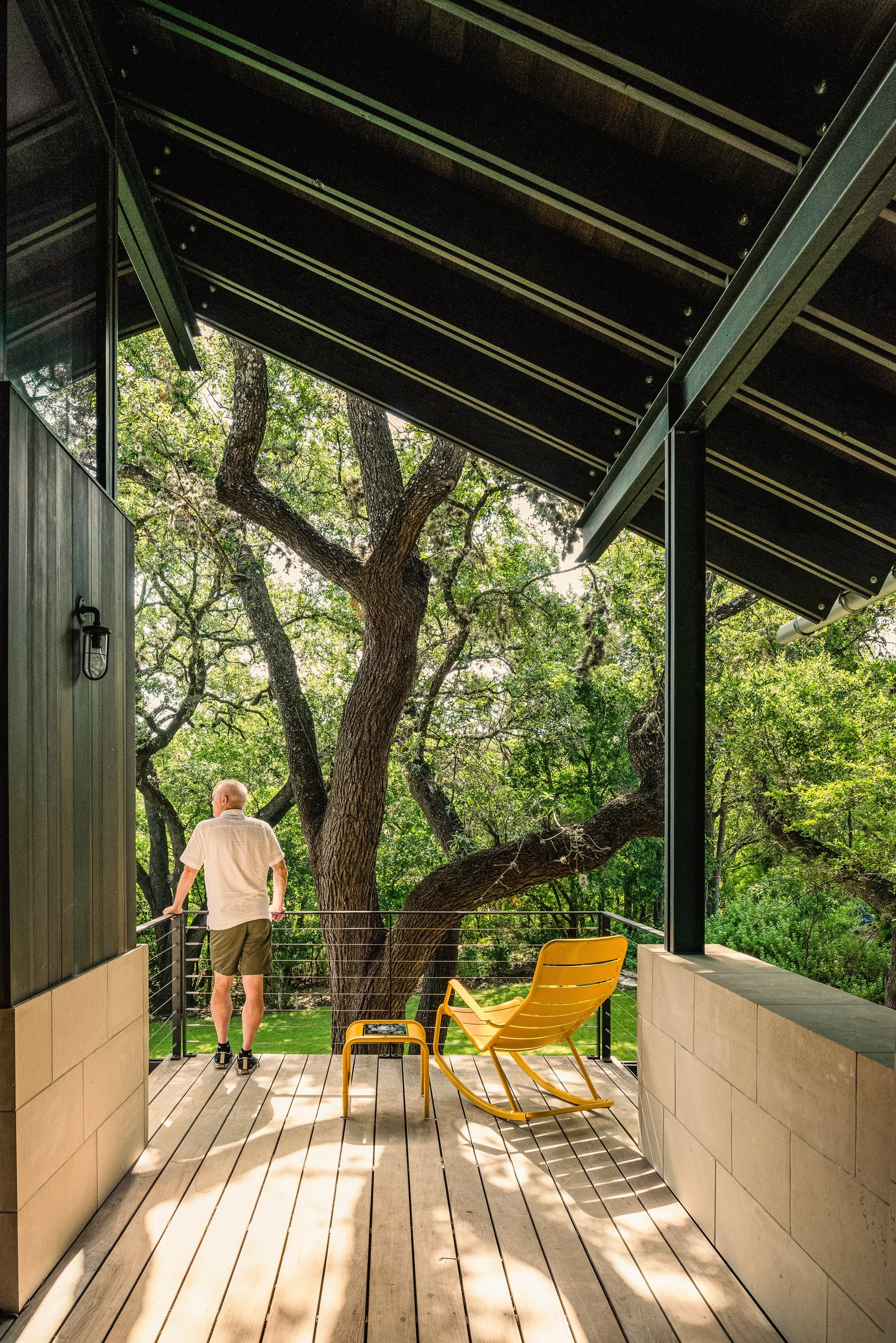
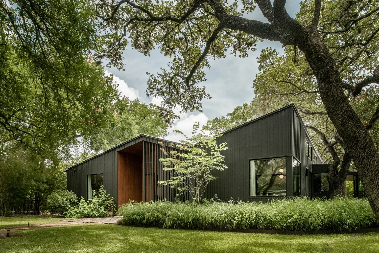
Some projects announce themselves from the street. The Rollingwood Residence doesn't. From the road, it reads as a compact, carefully composed modern home on a wooded lot — restrained, even modest by the standards of the Austin luxury market. Walk through it, and the restraint reveals itself as precision. The house cascades down a steep hillside through a series of stepped levels, each one reaching further into the tree canopy, until the screened porch at the lower end feels genuinely suspended in the oaks. The project has been published in Dwell and featured on the AIA Austin Homes Tour, and it deserves both.
Lake|Flato associate Brian Comeaux led the design. The firm has been practicing out of San Antonio and Austin since 1984, and their work has a consistent quality of regional attentiveness — buildings that read the climate, the topography, and the existing landscape before they commit to a form. The Rollingwood Residence is that sensibility applied to a double-wide lot on a horseshoe-shaped street in one of Austin's quieter enclaves, ten minutes from downtown but dense with old oaks and backed by a creek. The brief from the owners was direct: small but highly designed. Not a McMansion. A house scaled to how two people actually live.
That brief produced a 2,400-square-foot home that accomplishes more per square foot than almost anything I've photographed at twice the size.
A House That Follows the Hill
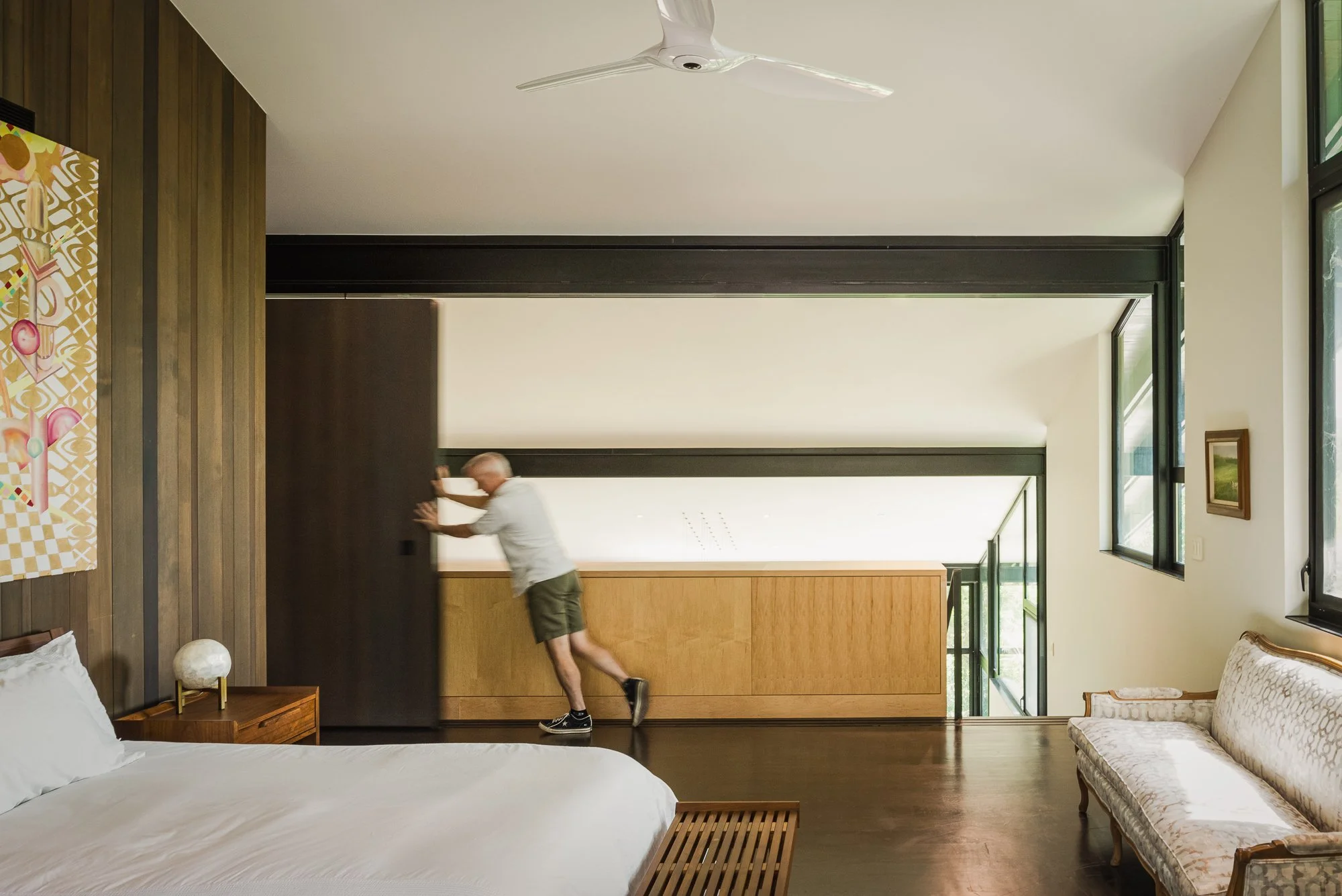
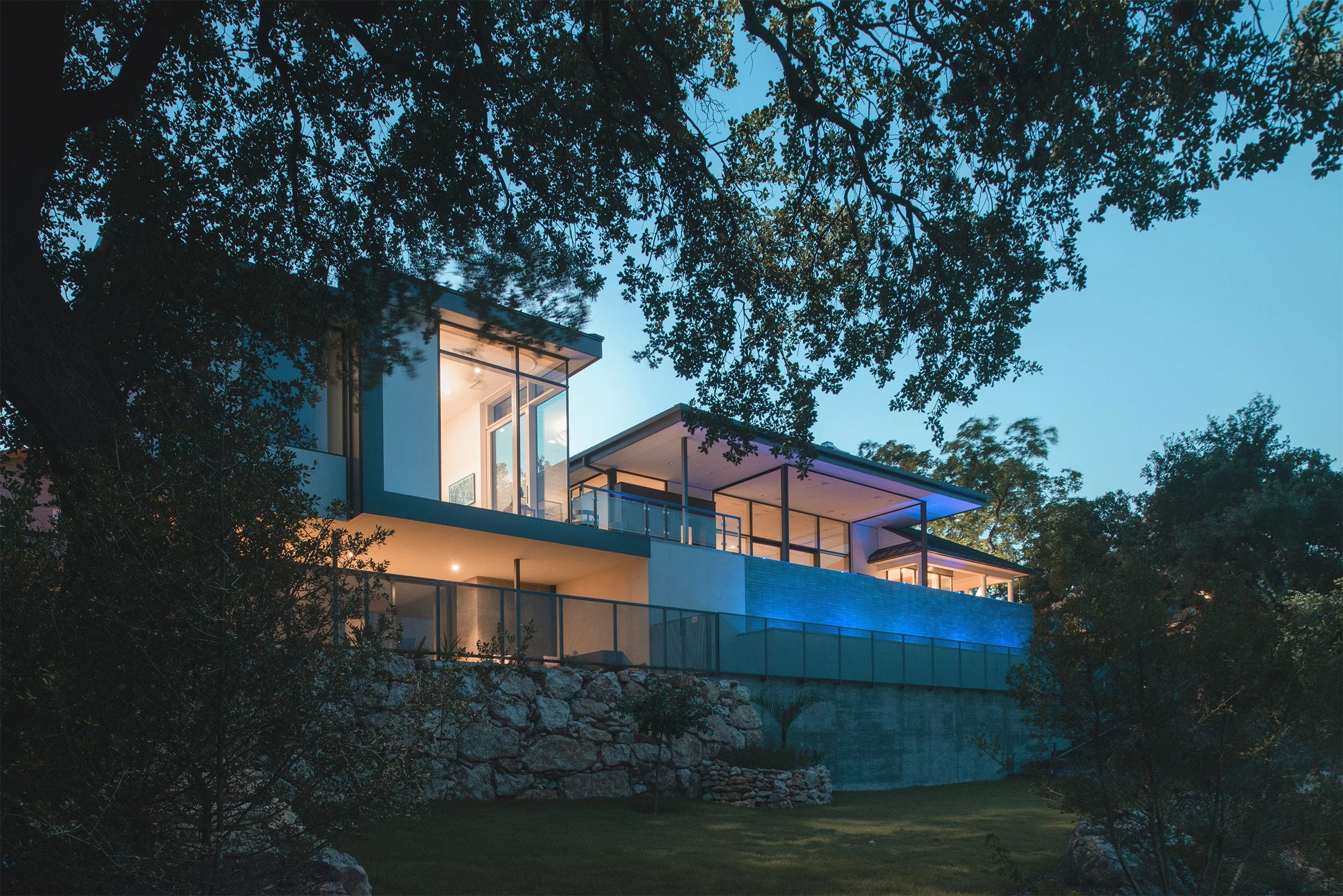
The site drops steeply from the street toward the creek below, and the architecture doesn't fight it. The program is stacked in terraced levels that step down the slope, with the main living volume at the top and the primary bedroom and screened porch cantilevered at the lower end above the tree canopy. An offset gable roof follows the grade of the land, its floating geometry guiding the eye downhill toward a path of restored rock ledges — hand-laid by the owners themselves — that leads to a dry creek, a small amphitheater, and a private gathering space carved from the existing rock outcroppings.
This is the move that makes the Rollingwood Residence worth studying: the house and the landscape are designed together, each one making the other more legible. The architecture gives you elevated vantage points into the oaks. The landscape gives the architecture something worth looking at from every window. Comeaux describes Rollingwood as a hidden gem, and this lot — dense with mature trees, backed by a creek, close enough to downtown to be convenient but quiet enough to feel removed — earns that description. The compact driveway and building footprint were pushed to the west edge of the property specifically to leave the natural green space to the east undisturbed.
The siting decision isn't incidental. It's the first architectural move, made before a wall goes up. Photographing a house like this means understanding that the relationship between building and land is the subject — not just the building.

The Materials Argument
The exterior is Western red cedar and Lueders limestone. Both are materials with a history in Texas architecture, chosen here for the same reason they've always worked in this climate: they're honest, they age well, and they read as belonging to the landscape rather than imposed on it. The cedar will silver over time. The limestone, quarried from the same general geology as the creek rock below the house, ties the building to its site in a way that's almost geological.
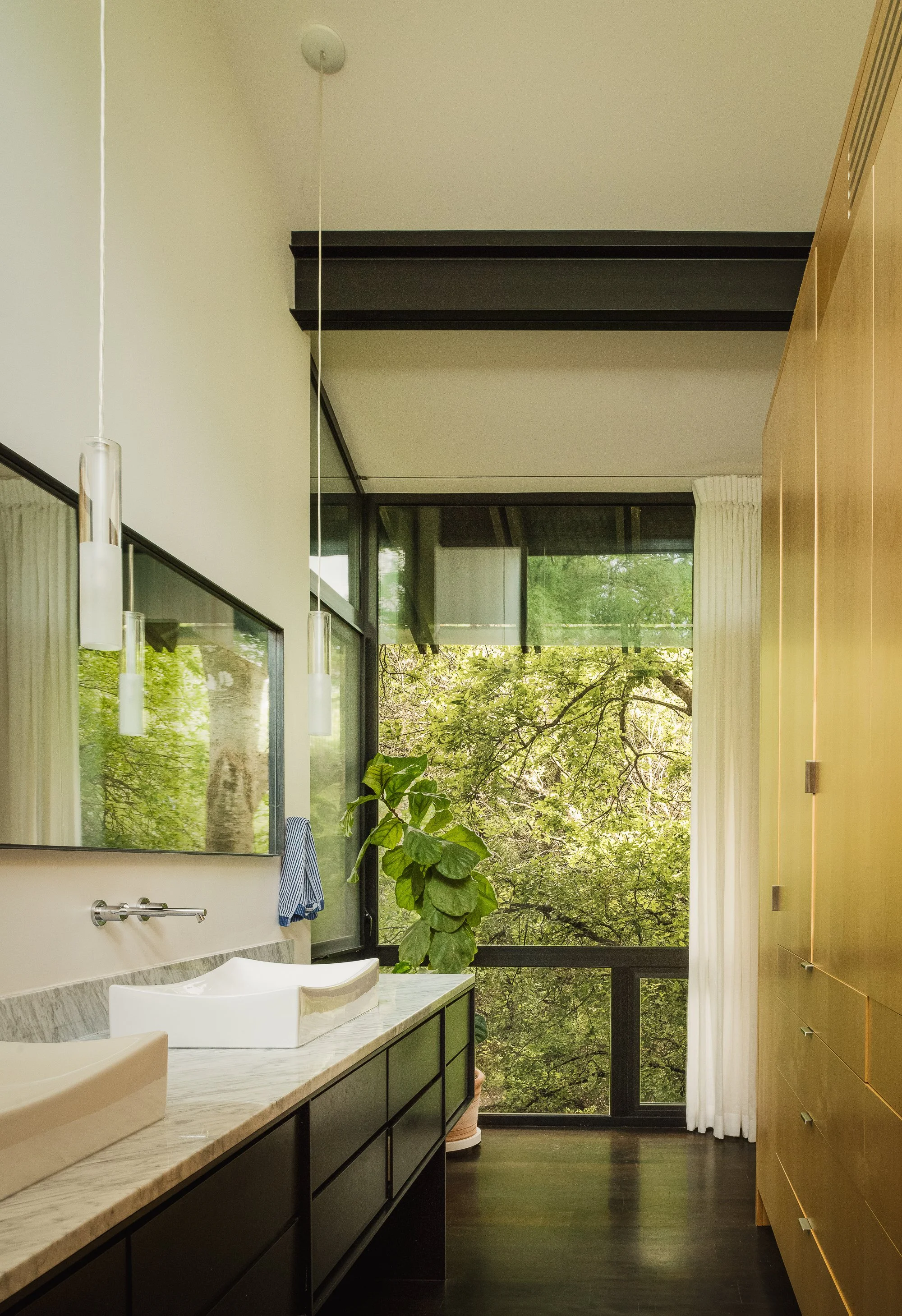
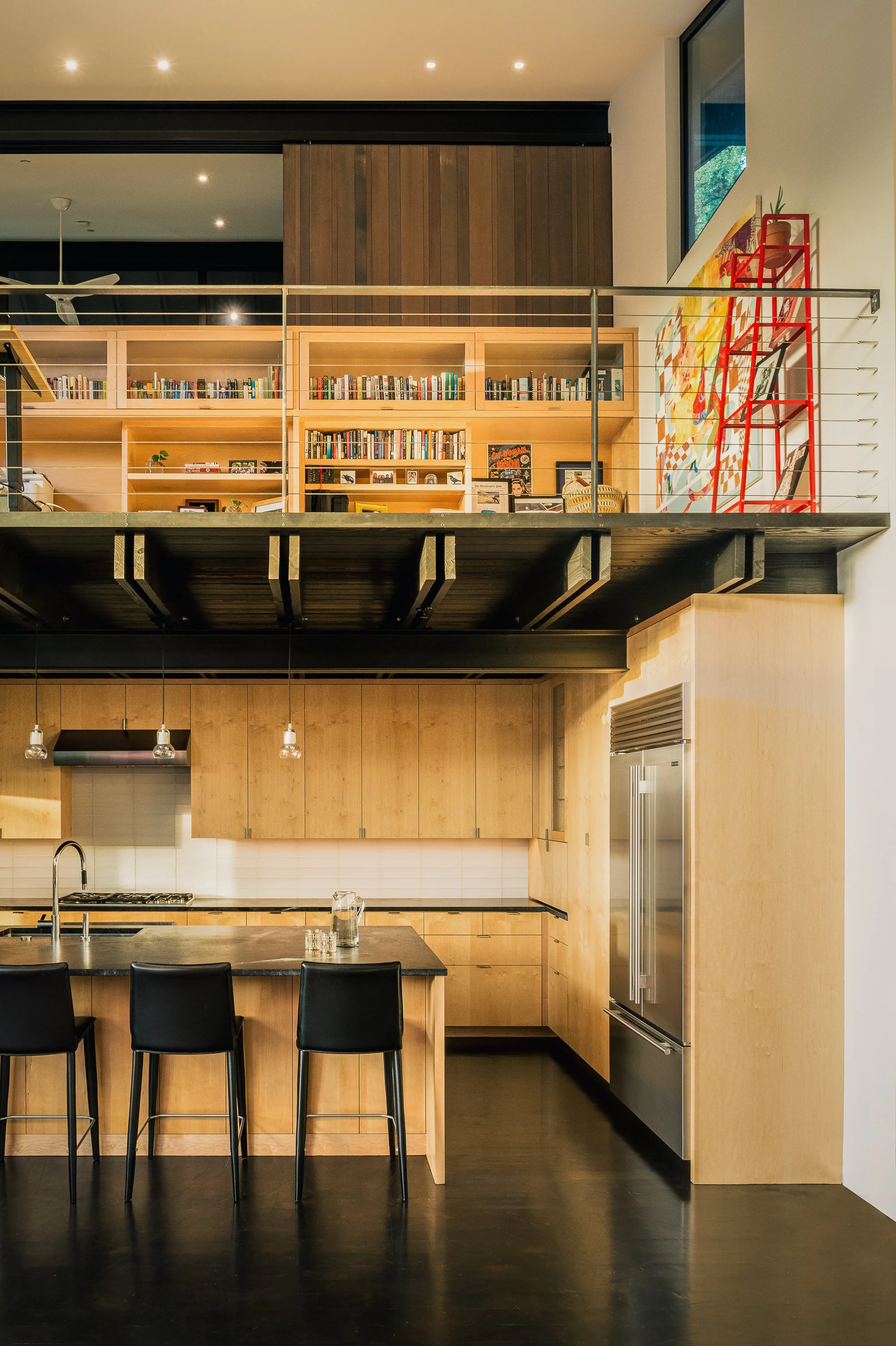
Inside, the palette shifts but maintains the same logic. Blackened mesquite floors anchor the main living level — a material that's distinctly Texan, dark and rich against the lighter tones of the clear sealed maple millwork. Soapstone countertops in the kitchen. Honed limestone underfoot in other areas. Douglas fir joinery, left exposed in the ceiling plane, brings warmth to the upper reaches of the 18-foot living room. Every material selection was made, Comeaux explains, by thinking about the house as a whole collection — nothing chosen in isolation, everything evaluated against what it sits next to.
This approach to material restraint is something I encounter in the best architectural work and rarely in lesser projects. When a design team has exercised this kind of discipline, the photographer's job is clarified: show the materials clearly. Don't dramatize. Let the palette do the work. A room with blackened mesquite, maple millwork, and soapstone doesn't need to be lit dramatically. It needs to be shown honestly, with light that reveals texture and relationship rather than manufacturing atmosphere.
The Living Room and the Glazed North Facade
The main living volume is where the spatial ambition of the project is most concentrated. An open plan combines kitchen, dining, and living under 18-foot ceilings, with a glazed northern facade that runs floor-to-ceiling across the primary view. The orientation is deliberate — north light is consistent, diffuse, and doesn't create the harsh contrast shadows that direct southern exposure would in a Texas summer. The view through those windows is into the oaks, and at certain times of morning, the light filtering through the canopy into the living room has a quality that's almost aquatic — green-tinged, moving, alive.
The fireplace anchors one end of the main level. A few steps down, through a spatial compression that works the way good section design always does — making the release feel earned — the screened porch opens off the primary bedroom. Cantilevered over the surrounding canopy, with an imposing stone fireplace of its own and screens that frame the oaks rather than blocking them, this porch is where the treehouse analogy stops being a metaphor. You're genuinely in the trees. The floor is hovering over sloped ground. The branches are at eye level. The owners chose this house because they wanted to feel close to the landscape, and this is the room where the design delivers that most completely.
Photographing the screened porch required the same patience as the Camp Frio porches — managing the light differential so the screen reads as transparent rather than as a visual barrier, finding the moment when interior and exterior are in close enough balance that the camera can see through rather than stopping at the mesh. Late afternoon worked best, with warm interior light beginning to assert itself against a softening exterior.
Two Masters, One House
The spatial organization of the bedrooms is one of the more unusual features of this project, and worth understanding. Both bedrooms are designed as primary suites — the downstairs suite positioned for hot Texas summers, the upstairs one for cooler months, with a second-floor porch shaded by a large oak and dark slate tiling in the bath. The millwork in the downstairs suite stops short of the ceiling, allowing light to spill from the main space into the master bath — a detail that's invisible in a floor plan and immediately legible in person.
This seasonal flexibility in how the house is occupied is a genuinely thoughtful response to Austin's climate. It also reflects the owners' approach to the project overall: a house designed around how two people actually live, rather than how a house is supposed to be presented. No rooms they wouldn't use. No space for its own sake. The Dwell article quotes them directly: "A bigger house isn't always a better house."
That's the kind of conviction that produces architecture worth photographing.
Why This Project Holds Up
The Rollingwood Residence was completed and published in Dwell in early 2020. It appeared on the AIA Austin Homes Tour. It continues to appear in Lake|Flato's portfolio and in Shoberg Homes' project list as one of the cleaner examples of what a high-craft, site-responsive Austin residence can be.
What strikes me about projects like this — compact, precise, deeply considered — is how well they photograph over time. The restraint that might seem understated in person reads as confidence in an image. There's nothing to remove, nothing that was included for effect. Every material, every spatial relationship, every view through a window was considered as part of a whole. The camera finds that coherence and holds onto it.
This is what I try to bring to every project I photograph: the same attention the architects brought to the design. Not to illustrate a building, but to reveal it. The Rollingwood Residence rewards that approach.
Project Details Architecture: Lake|Flato Architects — Brian Comeaux Builder: Shoberg Homes Lighting Design: David Nelson & Associates Cabinetry: HEWN Structural Engineer: Structural Design Consulting Location: Rollingwood, Austin, Texas Size: 2,400 square feet Published: Dwell Recognition: AIA Austin Homes Tour Photography: Tobin Davies
Tobin Davies is a luxury architectural and interior photographer based in Austin, Texas. He works with architects, interior designers, builders, and developers on residential and commercial projects throughout Texas and nationally. For shoot inquiries, visit tobindavies.com/contact.
What Is Cost-Sharing in Architectural Photography and How Does It Work?
Cost-sharing means splitting the investment in architectural photography among the parties who benefit from the images -- the architect, interior designer, builder, owner, and sometimes others. Each party receives a usage license, and the total fee is divided accordingly. It's the most effective way to get high-quality images of a project without any single party absorbing the full cost. I use this structure on roughly half my shoots, and it consistently produces better outcomes for everyone involved.
Why does cost-sharing exist in architectural photography?
Because good architecture is never the work of one person.
A completed project represents the combined effort of an architect, an interior designer, a builder, a landscape architect, and often a handful of consultants and product manufacturers. Each of those parties has a legitimate interest in documenting the finished work -- for their portfolio, their website, their award submissions, their marketing. And each of them benefits when the images are excellent.
The traditional model -- one party hires the photographer and everyone else either asks permission to use the images or goes without -- creates problems. The hiring party shoulders 100% of the cost. The other parties either use images they didn't commission (and may not be licensed to use), or they don't document the project at all. Neither outcome is good.
Cost-sharing solves this by acknowledging what's already true: multiple parties need these images, and it makes sense to produce them together.
How does the cost-sharing model actually work?
The mechanics are straightforward.
Before the shoot is booked, I work with the primary contact -- usually the architect -- to identify which other parties might want to participate. Common participants include the interior designer, the general contractor, the landscape architect, the homeowner, and occasionally a product manufacturer or structural engineer.
Each participating party receives a usage license for their share of the images. I charge a licensing fee for each additional party, then divide the total shoot fee by the number of participants. The result is that everyone pays less than any single party would have paid alone.
Here's how that plays out in practice. Say a full-day residential shoot is quoted at a certain rate for one party. Add a builder and an interior designer, and the per-party cost drops meaningfully -- often by 30-50% per participant depending on the scope. The shoot itself doesn't change. The quality doesn't change. The number of deliverables doesn't change. What changes is how the investment is distributed.
I handle the licensing and coordination. Each party signs a simple agreement, receives their licensed images, and can use them within the terms of their license. There's no ambiguity about who can use what.
Who typically participates in a cost-share?
The most common configuration is three parties: architect, interior designer, and builder. That's the core team on most residential projects, and each has a clear use case for the images.
Architects use them for portfolio, website, award submissions, and press. Interior designers use them for the same, plus social media and client presentations. Builders use them for marketing, client acquisition, and trade show displays.
Beyond that core, I've seen cost-shares that include:
Landscape architects. Particularly on projects where the site work is significant -- Hill Country homes with extensive hardscape, courtyard houses where the landscape is integral to the plan, or commercial projects with designed outdoor spaces.
Homeowners. Some owners want professional images of their home for personal use, insurance documentation, or because they're proud of what they built. They're often happy to contribute to the cost if they know the option exists.
Product manufacturers. A custom window company, a stone supplier, or a lighting manufacturer may want images showing their product installed in a beautifully designed context. This is less common but can be valuable when the project features a product prominently.
Developers. On commercial and multifamily projects, the developer or ownership group often has marketing needs that differ from the architect's. Including them in the cost-share means one shoot serves both purposes.
The key is raising the conversation early -- before the shoot is booked, not after. Once the photographer is scheduled and prep is underway, the window for coordinating additional parties tends to close.
Does cost-sharing affect the quality of the shoot?
No. This is the most important thing to understand about the model.
I don't shoot differently because three parties are paying instead of one. I don't add images I wouldn't otherwise take, or dilute the shot list to accommodate competing interests. The shoot is planned around the project -- around the architecture, the light, and the design intent -- the same way it would be regardless of how many parties are involved.
What does happen is that the shot list may be slightly more comprehensive. If the interior designer has specific vignettes they want captured, or if the builder wants images of a detail that demonstrates their craft, those get added to the plan. But they're additions to a shoot that was already well-planned, not diversions from it.
In practice, cost-sharing often produces a stronger image set than a single-party engagement. More perspectives on what matters about the project means more thoughtful planning. And when multiple parties are invested in the outcome, the preparation tends to be better -- spaces are more thoroughly staged, details are more carefully considered, and the shoot day runs more smoothly.
When should I bring up cost-sharing with my collaborators?
As early as possible. Ideally, the conversation happens when you first decide to photograph the project -- not after you've already booked the shoot and received a quote.
Here's why timing matters. If an architect books a shoot and then, two weeks later, asks whether the builder wants in, the builder is being asked to pay for something that's already happening. That's a harder sell than being part of the conversation from the start. When everyone is involved early, the cost-share feels like a shared decision rather than an afterthought.
The simplest approach: when you decide the project is ready to photograph, send a quick message to the other key parties. Something like, "We're planning to photograph the project next month. We're working with Tobin Davies and doing a cost-share to split the investment. Would you like to be included?" Most people say yes. The savings are obvious and the value is clear.
If you're not sure who else might want to participate, ask me. I've done this enough times to know which parties typically benefit and how to frame the conversation.
What about usage rights when multiple parties are involved?
Each participating party receives a license that covers their specific needs. The standard Professional Usage License I include with every shoot covers website, portfolio, social media (with photo credit), award submissions, presentations, trade show displays, and corporate collateral for a defined term.
The licenses are independent. The architect's usage rights don't depend on the builder's, and vice versa. If the interior designer wants to use an image on their Instagram, they don't need to ask the architect for permission -- they have their own license.
What the license does not include is transferring images to parties who didn't participate in the cost-share. If a subcontractor or product rep wants to use the images and they weren't part of the original agreement, they can obtain a separate license from me. This protects everyone's investment and ensures that usage is tracked and authorized.
I keep this simple by documenting everything upfront. Each party knows exactly what they're getting, what they can do with it, and for how long. There are no surprises after delivery.
Is cost-sharing worth it if I can afford the full shoot myself?
Usually, yes -- and not just because of the savings.
The financial argument is obvious: paying a third of the cost instead of the full amount is better for your budget. But the less obvious benefit is what happens to the images after delivery.
When three parties have licensed, professional images of a project, those images appear on three websites, three Instagram accounts, three award submissions, and three portfolios. The project gets three times the exposure. Your architecture is being represented by consistent, high-quality images everywhere it appears -- not by a mix of professional shots from your photographer and phone photos from your builder's site visit.
That consistency matters. When a potential client searches for your firm and sees the same polished images on ArchDaily, on the builder's website, and on the interior designer's Instagram, the project reads as credible and complete. When the images are inconsistent -- professional in one place, amateur in another -- the impression is fragmented.
Cost-sharing also strengthens your professional relationships. Inviting your builder or interior designer to participate signals that you see the project as a collaboration and that you value their contribution. That goodwill has a longer shelf life than the savings.
How do I get started with a cost-share on my next project?
Reach out to me when the project is nearing completion and you're starting to think about photography. Mention which other parties were involved and I'll help you frame the cost-share conversation.
I'll prepare a proposal that outlines the shoot scope, the per-party cost at different participation levels, and the licensing terms for each participant. You share it with your collaborators, and we finalize the group. From there, the process is the same as any other shoot -- shot list, prep, shoot day, delivery -- with the added benefit that everyone is invested in the outcome.
The best cost-shares I've been part of happened because one person -- usually the architect -- took five minutes to send an email to their project team. That small act of coordination saved everyone money and produced images that served the entire team for years.
Tobin Davies is a luxury architectural and interior photographer based in Austin, Texas. He works with architects, interior designers, builders, and developers on residential and commercial projects throughout Texas and nationally. For shoot inquiries and cost-sharing proposals, visit tobindavies.com/contact.
How to Prepare Your Project for an Architectural Photoshoot
The best architectural shoots are never improvised. Start coordinating with your photographer four to six weeks before the shoot date — sooner for large or complex projects. Build a shot list together, stage the space to read as designed rather than lived-in, and clear the exterior of anything that doesn't belong in the frame. Give your photographer context: the design intent, the key views you care about, and which details were yours. That's what turns a shoot day into something productive instead of expensive triage.
When should I start preparing for an architectural photoshoot?
Four to six weeks out is the minimum. On larger residential projects — anything with multiple buildings, a complex landscape program, or phased construction — I'd push that to eight weeks.
The reason isn't logistics for its own sake. It's that preparation has a sequence. The shot list needs to come before the staging conversation, the staging conversation needs to happen before the walk-through, and the walk-through needs to happen before you schedule the shoot day. Compress that sequence and something falls through. Usually it's the detail you most wanted captured.
There's also a practical reality around construction timelines: things run late. Scheduling a shoot with real buffer means that when the punch list drags into week three, you're not also scrambling to reschedule a photographer who had already locked travel.
If the project involves twilight photography — and for most exterior-heavy shoots, it should — add another variable. Twilight windows run twelve to twenty minutes. You don't get a second chance at that light. That's not something you want to be coordinating the morning of.
Who creates the shot list, and what should it include?
Both of us. That's the honest answer.
You know the project in a way I don't when I arrive. You know which wall detail was the one that took three material revisions to get right. You know that the connection between the kitchen and the courtyard is the move — the thing the whole plan is organized around. That knowledge needs to be in the shot list, not discovered mid-shoot.
What I bring is an understanding of what's actually photographable. Some things that matter enormously in the experience of a space — a ceiling height, the way light moves through a room over the course of a day — are genuinely difficult to convey in a still frame. Some things that seem secondary translate exceptionally well. Part of my job is to align your priorities with what the camera can do.
A good shot list has three layers. First, the establishing shots — the images that show the project in its full context, inside and out. Second, the room-by-room or space-by-space sequence, each with a primary angle and one or two alternates. Third, the details: the moments where materiality, craft, or spatial invention is most concentrated. For a well-organized shoot, fifteen to twenty final deliverable images might draw from thirty to forty setups on the shot list.
Send me drawings before we finalize the list. Floor plans and sections help me understand the geometry of the spaces before I walk in. I can anticipate where the light will be at different times of day, flag spaces that might be challenging, and propose a sequencing that works with the sun rather than against it.
What does "ready to photograph" actually mean for interior spaces?
It means the space reads as the architect or designer intended it — not as someone lives in it.
That's a harder standard than it sounds. Even beautifully designed homes accumulate visual noise: phone chargers on countertops, shoes near the door, a jacket on a chair, small appliances that emerged from cabinets and never returned. None of that is anyone's fault. But the camera sees all of it, and removing it in post is expensive and often unconvincing.
The most useful framing I give clients: walk through the space and ask, for every object you see, whether it was placed by the designer or by the life being lived in it. If it's the latter, it probably needs to come out for the shoot.
Furniture placement matters more than most people expect. Pieces that were moved for practical reasons — pulled away from a wall to make a traffic path easier, angled for TV viewing rather than conversation — should go back to their design positions for the shoot. I'll make adjustments during setup, but I can only work with what's there.
For staged or recently completed projects, the work is different. Empty houses photograph poorly — they lack scale and warmth. If the project was designed with a specific furniture program in mind, now is the time to make sure key pieces are present. A curated selection of art, objects, and soft goods does more for a photograph than any amount of post-production.
One more thing: clean the glass. Windows, skylights, shower enclosures. The camera reads every smudge and water spot at full scale.
How do I prepare the exterior of the project for photography?
The exterior is where most last-minute problems land, and it's the category most difficult to fix the day of.
Landscaping should be in its intended condition — not necessarily full maturity, but maintained and intentional. A newly planted lawn that's still patchy reads on camera as incomplete, not just young. If there are trees or shrubs that were meant to be in the frame, they should be in the frame. If the landscaping is still in progress, I need to know that before we schedule, because it affects which views are viable.
Driveways and hardscape should be clear of vehicles, equipment, and construction debris. This seems obvious until you arrive at a shoot and there's a subcontractor's truck parked in the primary composition because someone forgot to coordinate. Give everyone involved — builder, owner, neighbors — a heads-up about the shoot date and what you need.
Speaking of neighbors: if the project has key exterior views that pull neighboring properties into frame, it's worth a conversation. A boat parked next to the fence, a trash can that lives at the curb, a basketball hoop that appears in the background — these are small things that require either neighbor cooperation or significant post-production. The former is faster and cheaper.
Construction signage, builder banners, and permit boxes should be removed or moved out of camera range. I can work around most things, but there's no elegant way to recompose away a six-foot job site sign.
Why does time of day matter, and should we plan for twilight?
Light is the medium. Everything else is subject matter.
The direction, quality, and color temperature of natural light determine what a space looks like in a photograph. A room that's spectacular at ten in the morning can be flat and difficult at two in the afternoon. An exterior that comes alive at golden hour can be harsh and shadowless at noon. Scheduling a shoot without thinking about this is like scheduling a paint consultation without thinking about the wall color.
For most Austin-area projects, I start exterior photography in the early morning or late afternoon — when the sun is low and the light is warm, directional, and doing something interesting. Interior photography gets sequenced around which rooms receive good light at which times. That sequencing is part of what I'm doing when I build out the shoot day schedule.
Twilight is worth planning for on almost every project that has exterior architecture worth showing. The window is short — usually twelve to twenty minutes between when the sky has the right ambient exposure and when it goes dark. But the images that come out of that window are often the strongest in the deliverable set. The combination of interior light glowing from within, exterior materials rendered in ambient blue, and a sky that still has color and detail is difficult to replicate at any other time of day.
Weather is a variable I can't fully control, but I plan around it. Overcast days produce excellent soft light for interiors. Partly cloudy days can produce dramatic skies that add to exterior images. Heavy rain delays shoots. I build flexibility into my scheduling for this reason — it's better to have a backup date confirmed in advance than to scramble the morning of.
What should the architect or designer communicate before the shoot?
More than most do.
The single most useful thing you can give me is design intent — not a project description, but a sense of what the project is for. What problem was it solving? What experience were you trying to create? What's the move that makes this project different from the last one? That context shapes everything: which details I look for, how I frame the establishing shots, what story the final image set should tell.
Beyond intent, give me the key views you care about. Every architect has two or three compositions they've been seeing in their head since early schematic design. Tell me what they are. I may have a different read on what's going to be most compelling photographically, and we can have that conversation — but I need to know what you came in hoping to see.
Tell me which elements were designed and which were inherited. In renovation projects especially, this matters. If the windows were original and you worked around them, I should know that. If the flooring was the owner's selection and you'd rather not feature it, tell me. I'm not going to make editorial decisions about what to emphasize without that context.
Finally: if there are drawings, sections, or renderings that show the design intent for a particular space, share them. Arriving with a section drawing of a key room tells me the ceiling geometry, the relationship between levels, and the angles that read best. That's a better briefing than a walkthrough alone.
Can other parties share the cost of an architectural photoshoot?
Often, yes — and it's worth raising early.
On most residential projects, there are multiple parties who benefit from strong photography: the architect, the interior designer, the builder, and sometimes the owner. Each party will use the images for different purposes — portfolio, website, press submissions, Instagram, marketing materials. Each has a reason to want the images to be excellent.
The simplest arrangement is a cost-share where each party contributes to the shoot fee in proportion to how much they'll use the images, and usage rights are licensed accordingly. I'm straightforward about how this works. It doesn't affect how I approach the shoot — it just determines who gets what in the final delivery.
Raise this conversation with your collaborators before you book, not after. Once the shoot is scheduled and the prep work has begun, the window for that conversation tends to close.
What mistakes waste the most time on a shoot day?
A few come up again and again.
Spaces that aren't staged until I arrive. I can't set up a shot while someone is still moving furniture and clearing countertops in the same room. Those two things need to happen in sequence, not simultaneously.
Decisions about what to include made on the day. If you're not sure whether to stage the guest bedroom, make that decision before I arrive. Every unresolved question on shoot day costs time that should be spent behind the camera.
Chasing a light condition we missed. If we were scheduled to get the east-facing living room at nine in the morning and we didn't get there until eleven, that room may not be shootable until the following morning. Planning and sequencing exist to prevent this.
Bringing too many decision-makers. One primary contact on site is ideal. Two is manageable. A group of stakeholders with different opinions about how a space should look is a problem. Those conversations should happen before the shoot, not during it.
Not accounting for the space between spaces. Hallways, transitions, moments of arrival — these are often where the architecture is most concentrated. They fall off shot lists because they're not "rooms," but they're frequently the images architects and designers reach for most.
Preparation doesn't guarantee a perfect shoot. Light changes, something breaks, a space reads differently in person than in drawings. But a well-prepared shoot gives you the flexibility to adapt. An unprepared one means you're spending the day catching up to problems instead of making photographs.
Tobin Davies is a luxury architectural and interior photographer based in Austin, Texas. He works with architects, interior designers, and developers on residential and commercial projects throughout Texas and the wider region. For shoot inquiries and project consultations, visit tobindavies.com.
Photographing Camp Frio | A Modern Dogtrot on the Frio River | Cuppett Kilpatrick Architects | Tobin Davies
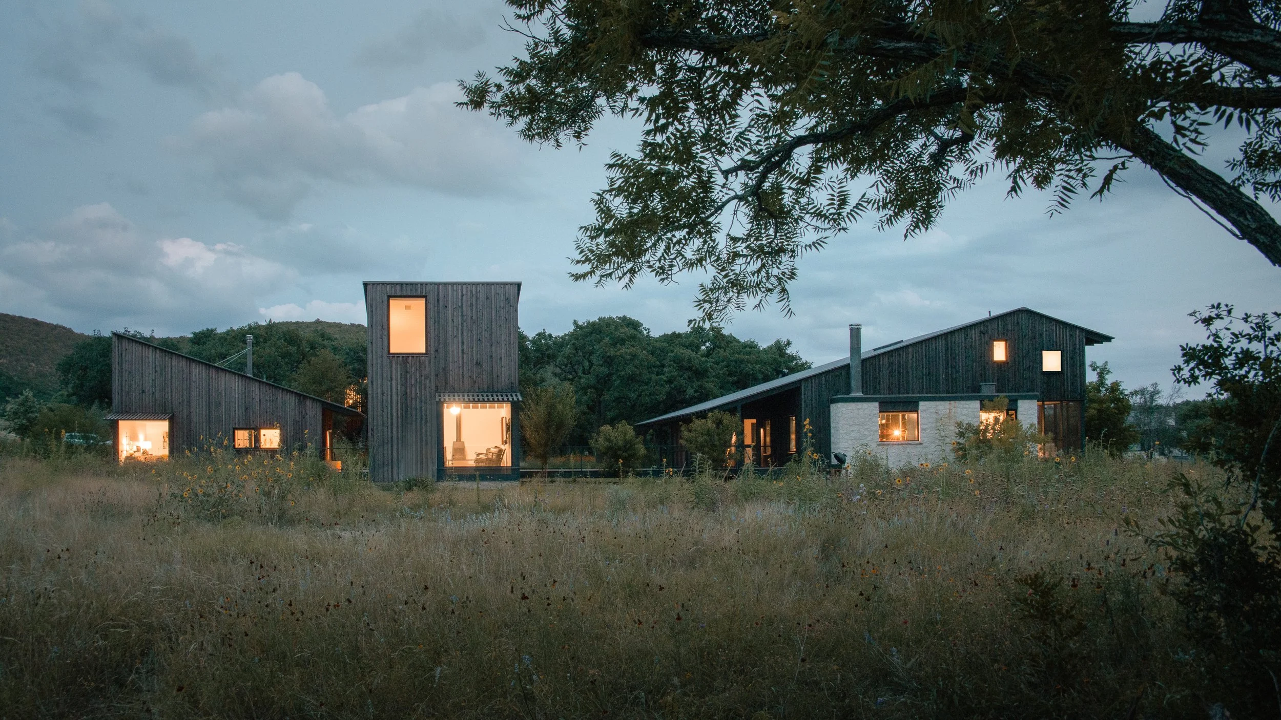
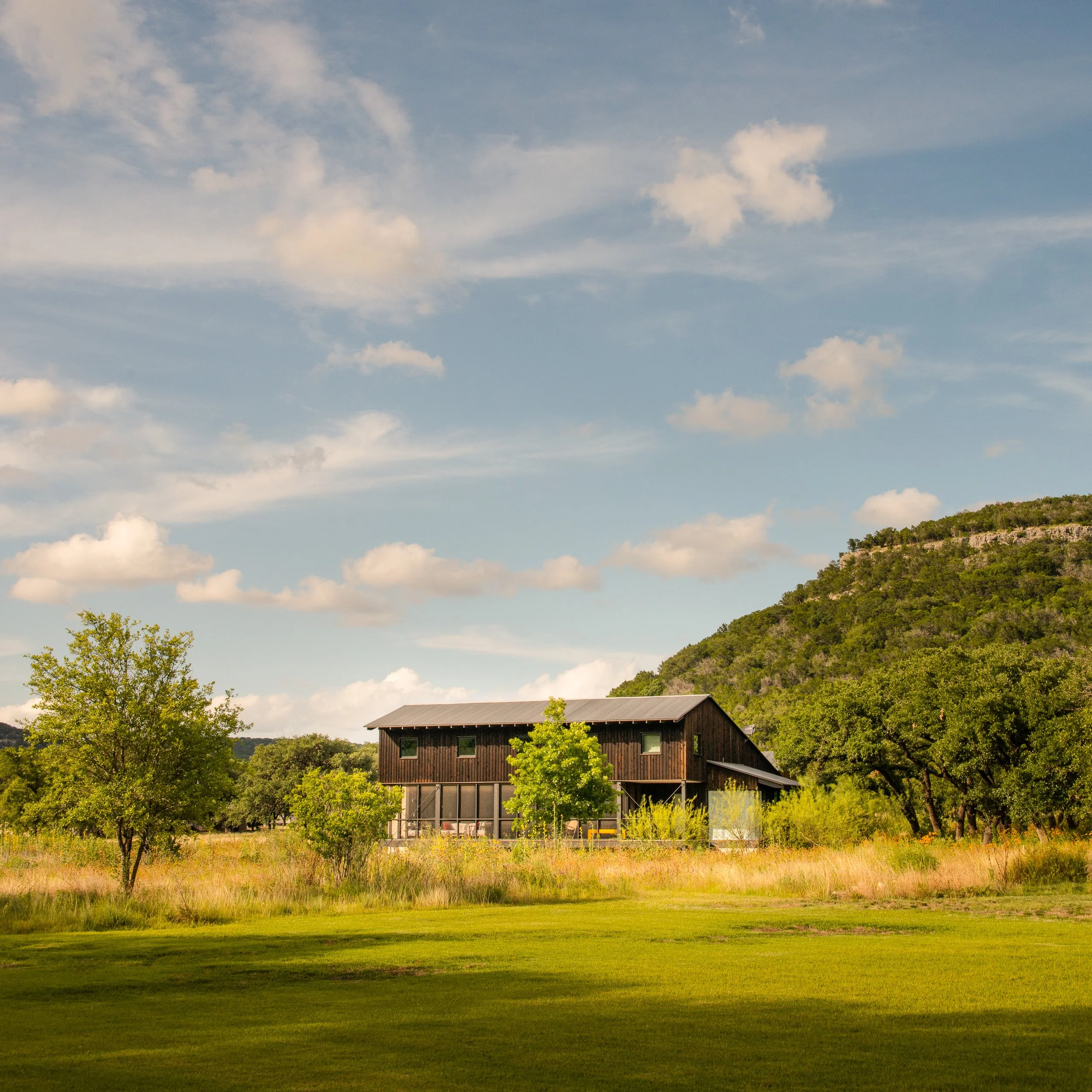
A short drive southwest of Austin, the Hill Country opens up into something older and quieter. The roads narrow. The cedar thickens. The Frio River — spring-fed, cold, running clear over limestone — cuts through valleys that feel unchanged in any meaningful way. This is where Camp Frio sits: a multi-structure family compound designed by Tim Cuppett and David Kilpatrick of Cuppett Kilpatrick Architects, built by Dalgleish Construction on a 2.8-acre riverfront parcel in the small town of Leakey, Texas.
I photograph a lot of luxury residential work in and around Austin. Modern homes with clean lines, sophisticated material palettes, Hill Country views. Camp Frio is something different. It's not trying to impress you with scale or finish. It's trying to get you outside. That distinction changes how the architecture works — and how you photograph it.
Architecture That Wants You to Leave
Tim Cuppett has talked about this openly: the design intent for Camp Frio was to make the indoors secondary to the outdoors. To build spaces that are comfortable enough to sleep in and cook in, but that constantly pull you toward the river, the grass, the sky. Most second-home architecture does the opposite — it imports the expectations of a primary residence into a vacation setting, resulting in houses that are oversized, over-finished, and disconnected from the land they sit on.
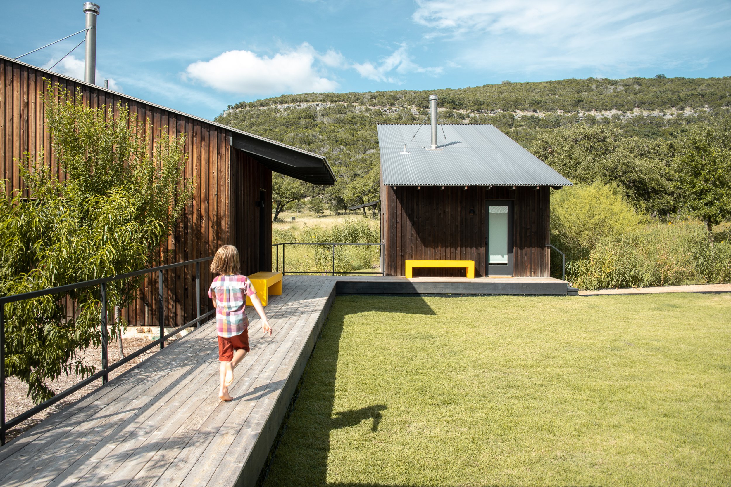
Cuppett and Kilpatrick took a different approach. They broke the program into four separate structures: a main house with a partial second-level bunkroom, two guest cottages with sleeping lofts, and a garage building with an art studio on the ground floor and a meditation room above. The structures are connected by a slightly elevated walkway that lets kids run barefoot between buildings without worrying about what's in the tall grass below. The compound reads less like a single house and more like a small settlement — a cluster of shelters scaled to the valley they occupy.
For photography, this distributed layout is both a challenge and an opportunity. You can't capture Camp Frio in a single hero shot the way you might a monolithic residence. You have to move through it. The story is in the relationships between buildings — how they frame views of each other, how they create outdoor rooms in the spaces between them, how the compound as a whole relates to the river and the meadow. I spent as much time photographing the negative space between structures as I did the interiors.
The Modern Dogtrot
The main house is organized around a central breezeway — a contemporary interpretation of the dogtrot, the open-passage house form that defined rural Southern architecture for generations. Concealed multi-slide doors on both ends of the breezeway allow it to function as an open-air dining room for most of the year. Close the doors in winter and it becomes an enclosed space with heating. A skylight above brings natural light into the center of the plan regardless of the season.
This is the architectural move that defines the project. The breezeway is the social heart of Camp Frio — the place where meals happen, where families gather, where the boundary between inside and outside dissolves completely on a warm evening. Photographing it required patience. The space reads differently depending on whether the doors are open or closed, whether the light is entering from the skylight above or from the landscape at either end. The best frame I found was from within the breezeway looking outward, with the Hill Country visible through the open doors — a shot that captures the dogtrot idea perfectly. You're sheltered but not enclosed. Protected but not separated.
The living room adjacent to the breezeway is its deliberate opposite: intimate, dark, moody. The owners described the duality as wanting spaces that are simultaneously cozy and spacious, dark and bright. Cuppett achieved this by keeping the living room compact with lower ceilings and wrapping it in rich, saturated color — guided by the homeowner, who has a background in art. The contrast between the bright, breezy dining breezeway and the cool, enclosed living room is one of the most interesting spatial sequences I've photographed. It's the architectural equivalent of stepping from a sun-drenched porch into a shaded interior on a hot day. Your eyes adjust. Your body relaxes. The architecture is doing exactly what the Hill Country climate asks it to do.
Materials That Belong
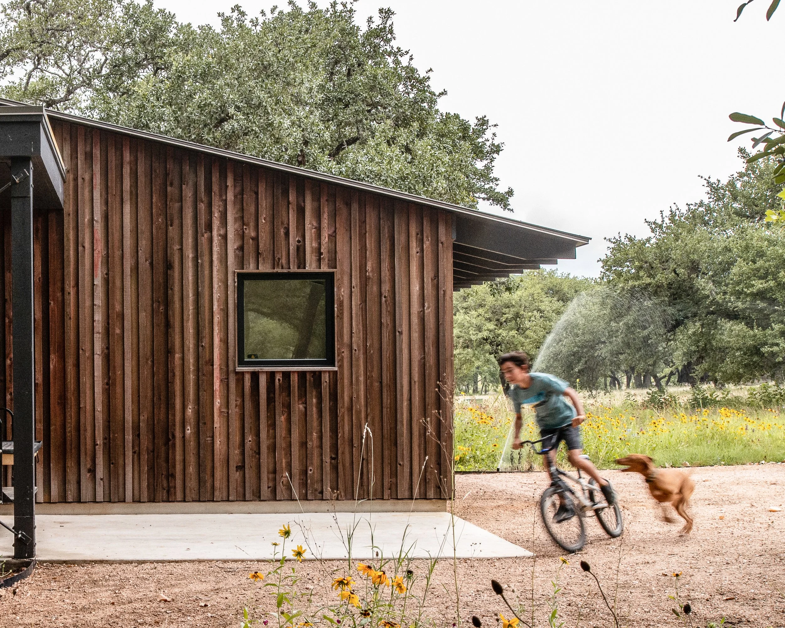
Camp Frio is built with materials sourced to match its context: rough-sawn cedar siding, Galvalume metal roofing, foundations clad in local limestone, and wire-brushed Douglas fir floors throughout. The palette reads as contemporary but rooted — modern in its composition and detailing, vernacular in its texture and tone. From a distance, the dark cedar structures could have been standing in this valley for decades. Up close, the precision of the joinery and the quality of the hardware tell a different story.
This is something Cuppett Kilpatrick does exceptionally well. Their design philosophy, which they describe as governed by the idea of editing, produces buildings that feel reduced to essentials without feeling austere. Every material earns its place. The cedar will weather and silver over time, drawing the buildings closer to the colors of the surrounding landscape. The metal roofs shed Hill Country rain efficiently and catch light in a way that reads beautifully at dusk, when the sky goes violet and the structures take on a warm glow from interior lighting.
Photographing these materials in the Frio River valley is different from photographing them in Austin. The light out here is harder, more direct, with fewer ambient surfaces to bounce fill into shadow areas. The landscape is bigger and less manicured. The sky takes up more of the frame. All of this pushes you toward a documentary approach — showing the buildings as objects in a landscape rather than as isolated compositions. The best images from this shoot feel like they could belong in a regional architecture monograph: the buildings small against the land, the materials honest, the relationship between structure and site legible at a glance.
Screened Porches and Sleeping Lofts
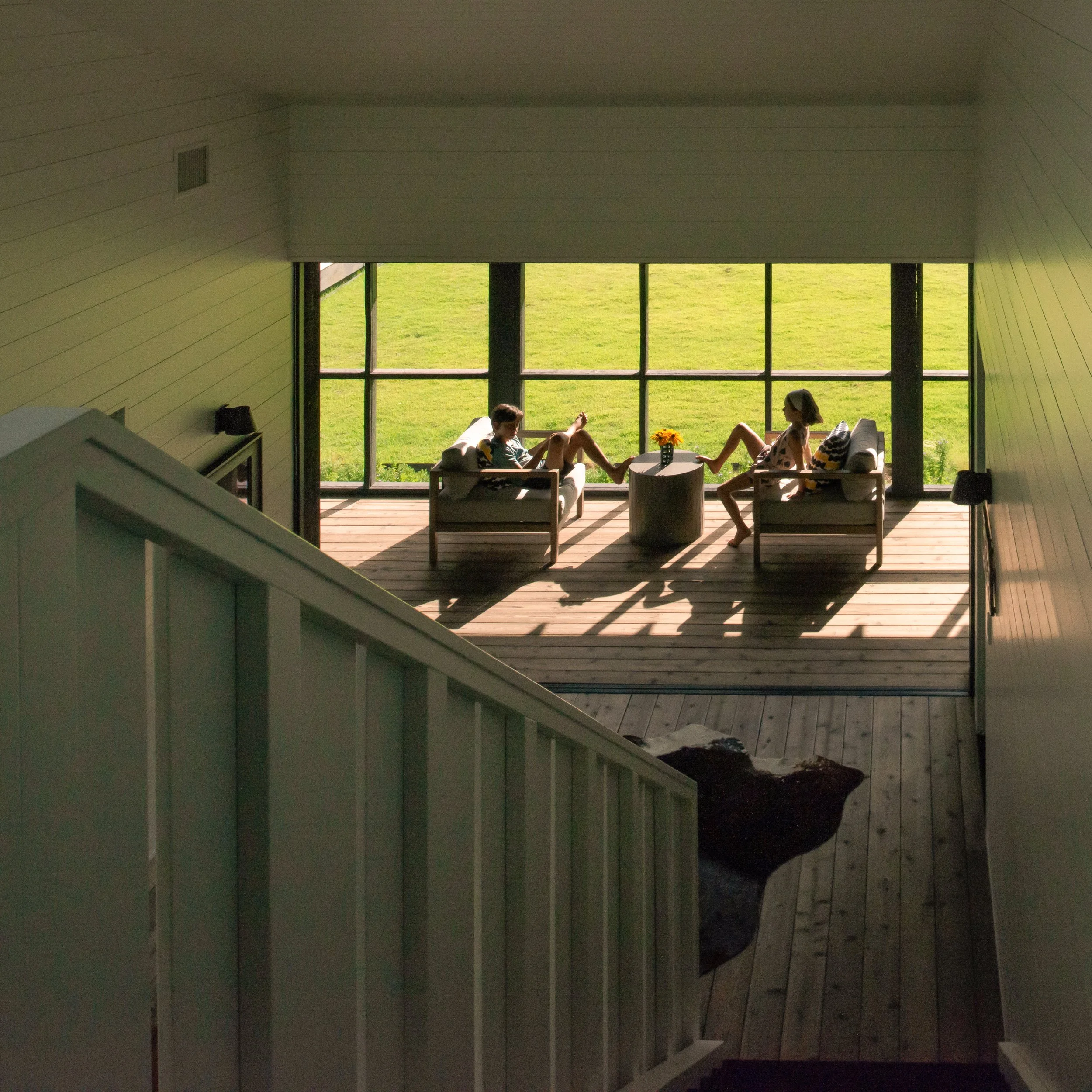
The screened porches at Camp Frio are not afterthoughts. They're primary living spaces — cozy rooms wrapped in screen that function as an intermediate zone between the sealed interior and the open landscape. On warm evenings, these porches become the most desirable rooms in the compound. They catch the breeze off the river. They keep the insects out. They let you hear the sounds of the valley — wind through the cypress trees, water moving over rock, the particular quiet that settles over the Hill Country after dark.
The guest cottages each contain a sleeping loft above the main level, accessed by a ladder. These lofts are sized for kids or for adults who don't mind climbing, and they reinforce the camp aesthetic that gives the project its name. There's nothing precious about these spaces. They're functional, well-built, and designed to encourage the kind of informal, multi-generational gathering that the owners envisioned. Families and friends spread across the compound, each group with its own cottage, connected by the walkway and drawn together at the breezeway for meals.
Photographing the screened porches presented an interesting technical challenge. Screen mesh can read as a visual barrier in photographs if the light isn't managed carefully — the camera sees the screen more aggressively than the eye does. The key is shooting when the light differential between inside and outside is minimal, so the screen becomes transparent rather than opaque. Late afternoon and twilight were the windows where these spaces photographed most honestly — the interior warm and inviting, the landscape beyond visible and in conversation with the room.
Frio Cañon and the Legacy Community
Camp Frio sits within Frio Cañon, a larger development conceived by builder David Dalgleish as a legacy community — a place designed for multi-generational family use, with a hundred acres of wildlife preserve, hiking trails, and community gathering spaces. Dalgleish, who built Camp Frio through his firm Dalgleish Construction, has maintained strict design guidelines for the community, working only with a curated list of architects to ensure that new construction respects the character of the land.
That context matters. Camp Frio isn't an isolated vanity project dropped onto a rural lot. It's part of a broader vision for how people can build in the Hill Country without consuming it. The architecture is sized to the site. The materials are sourced for longevity and regional appropriateness. The structures sit lightly on the land. These are values that show up in the photographs — not as talking points, but as visual qualities. When the architecture is right for its place, the camera recognizes it.
Why This Project Matters
Camp Frio has earned a 2019 Texas Society of Architects Design Award, a 2021 AIA Austin Design Award of Merit, a 2021 Architizer A+ Awards finalist designation, and features in ArchDaily, Dwell, Residential Design Magazine, and numerous architecture publications worldwide. That's a remarkable run for a 3,600-square-foot family retreat in a town of fewer than 500 people. The recognition reflects something important: this project has resonated with architects and design audiences far beyond Texas because it speaks to a set of ideas — about simplicity, about site, about what a second home should actually be — that are universally compelling.
For Cuppett Kilpatrick, Camp Frio represents the firm's design philosophy at its most distilled. Their practice is governed by Alexander Pope's directive to consult the genius of the place, and this project does exactly that. The genius of this place is the river, the valley, the quality of Hill Country light, and the particular feeling of being far enough from the city that the noise falls away. The architecture amplifies all of it.
This is the kind of project that expands a photography portfolio in valuable ways. My work is anchored in Austin — modern residential, urban and suburban contexts, clean-lined homes on manicured lots. Camp Frio shows something different: that the same photographic discipline applies in a rural, vernacular context. That the principles of reading light, understanding material, and revealing design intent don't change when the setting does. The audience that discovers these images on my site often arrives looking for Texas modernism and stays because the range of work tells a more complete story about what architectural photography can do.
Project Details Architecture: Cuppett Kilpatrick Architects — Tim Cuppett, David Kilpatrick Builder: Dalgleish Construction — David Dalgleish Interior Design: Homeowner with Adriana Chetty, Cuppett Kilpatrick Architects Landscape: Lionheart Places — Rebecca Leonard Engineering: Arch Consulting Engineers Location: Leakey, Texas (Frio Cañon) Size: 3,600 square feet (conditioned space), 2.8-acre site Completed: 2018 Awards: 2019 TxA Design Award, 2021 AIA Austin Design Award of Merit, 2021 Architizer A+ Awards Finalist Photography: Tobin Davies
Photographing the Clarksville Residence | Historic Meets Modern | LaRue Architects | Tobin Davies
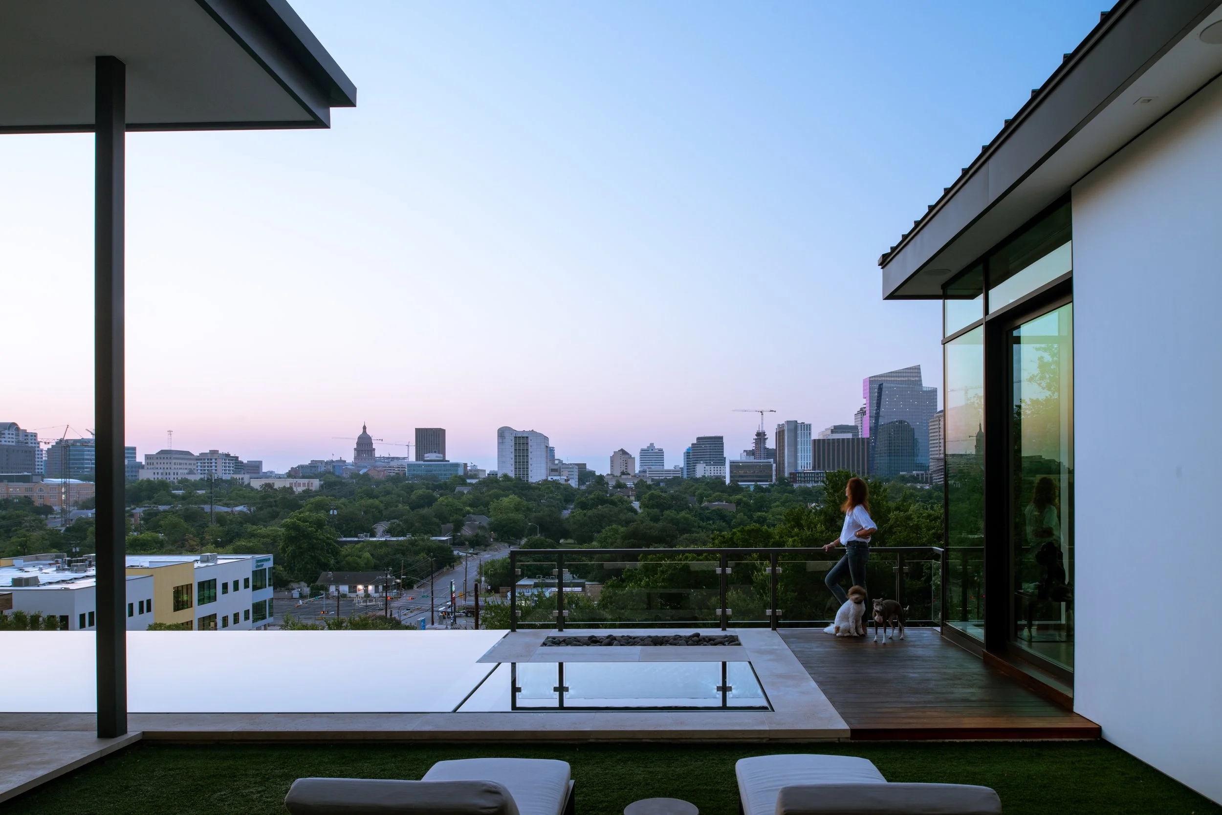
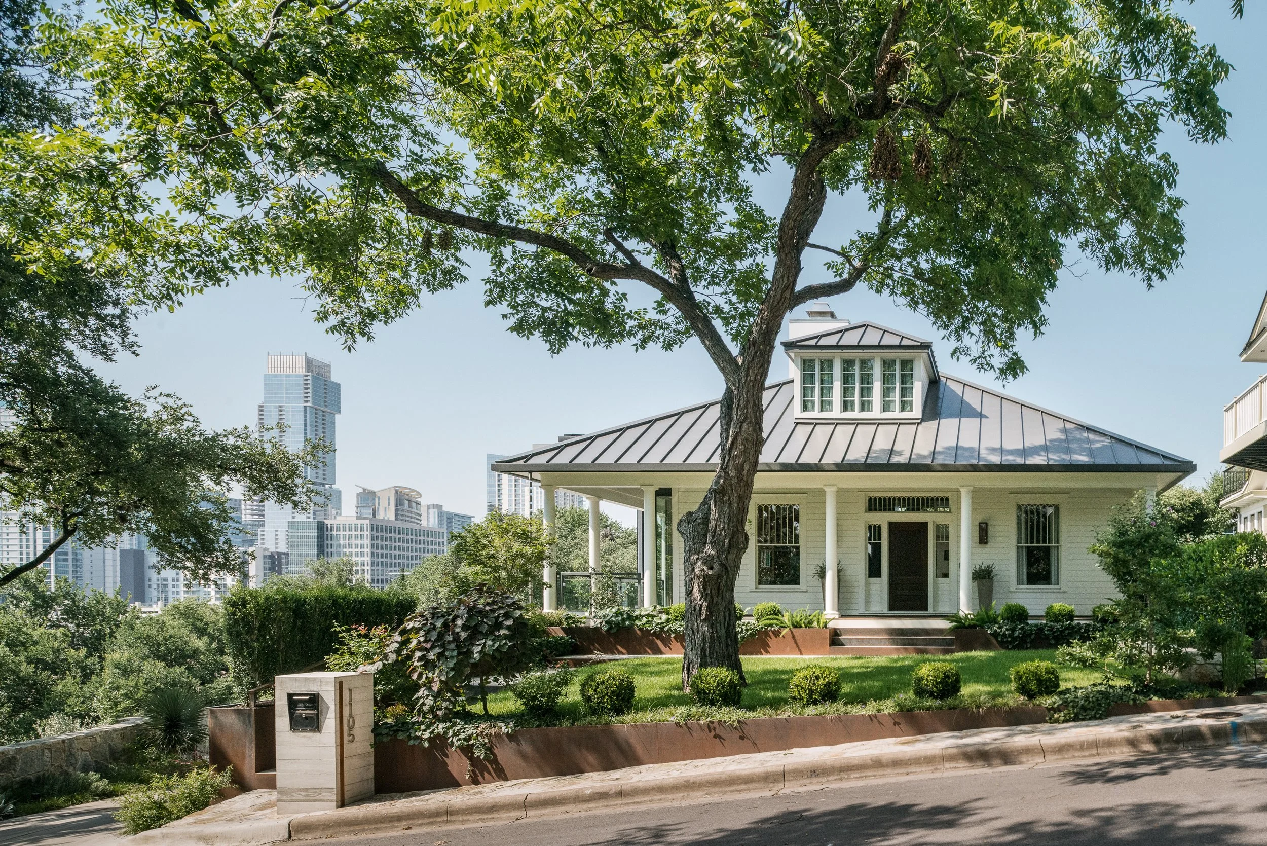
Most of my work begins with a blank site — raw land, a foundation, a set of drawings that will become something new. The Clarksville Residence is a different kind of project. It begins with something already there. A 1915 bungalow on a steep hillside in one of Austin's oldest neighborhoods, with views of the State Capitol and the downtown skyline that most architects would design an entire house around. LaRue Architects didn't start from scratch. They started from history — and built forward from it.
James LaRue and Emily Haydon were brought in to transform a house that had survived more than a century in a neighborhood where most of its contemporaries had been demolished. The previous owner had lived there for over fifty years and refused to let it be torn down. That kind of stewardship sets the tone for everything that follows. You don't bulldoze that story. You build on top of it.
Historic in the Front, Modern in the Back
The design concept is deceptively simple: preserve the traditional street-facing facade and add a modern glass-and-steel addition to the rear. In practice, this is one of the most technically and aesthetically demanding things you can do in residential architecture. The two halves of the house have to feel like they belong to each other — not like a renovation that happened to one of them.
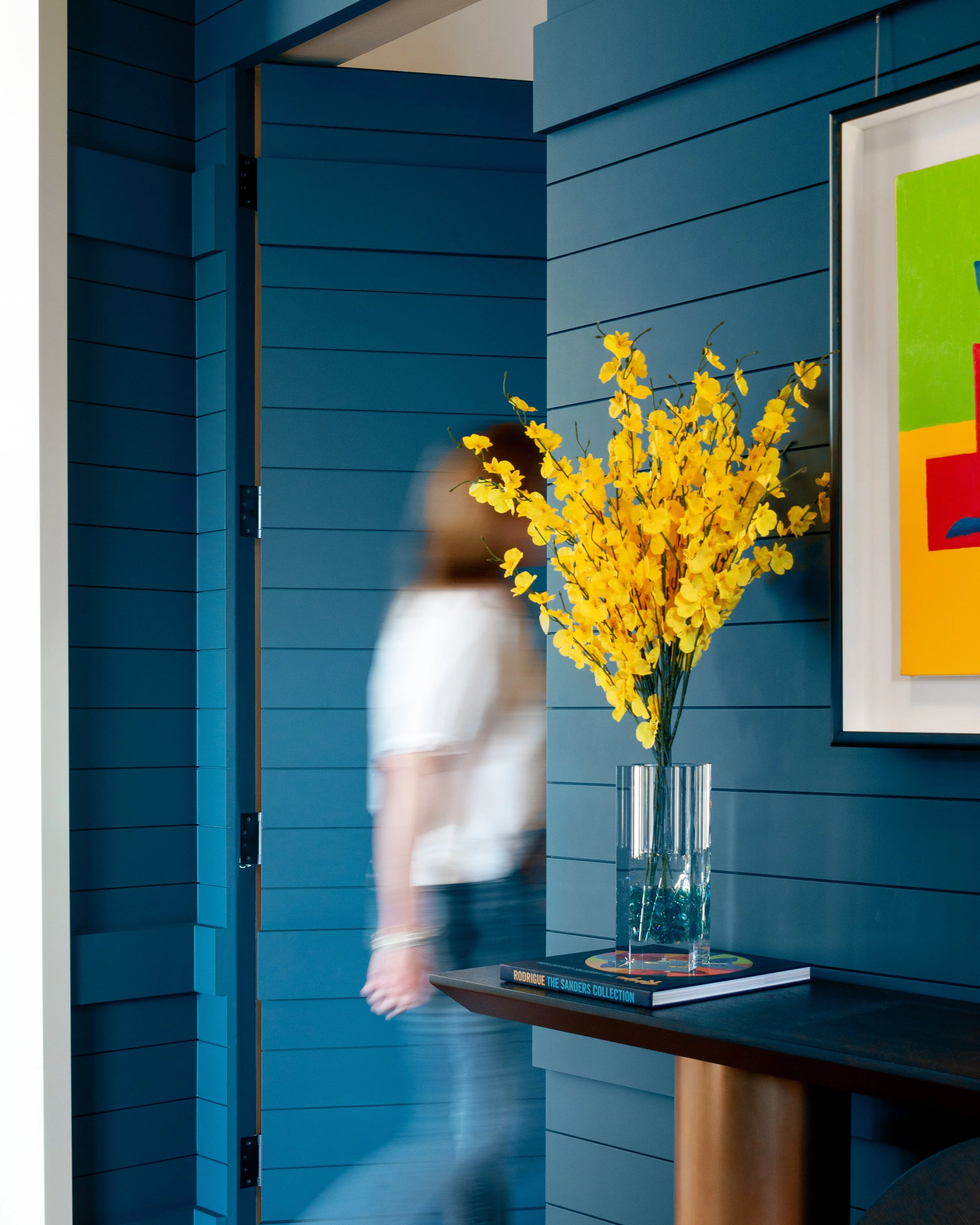
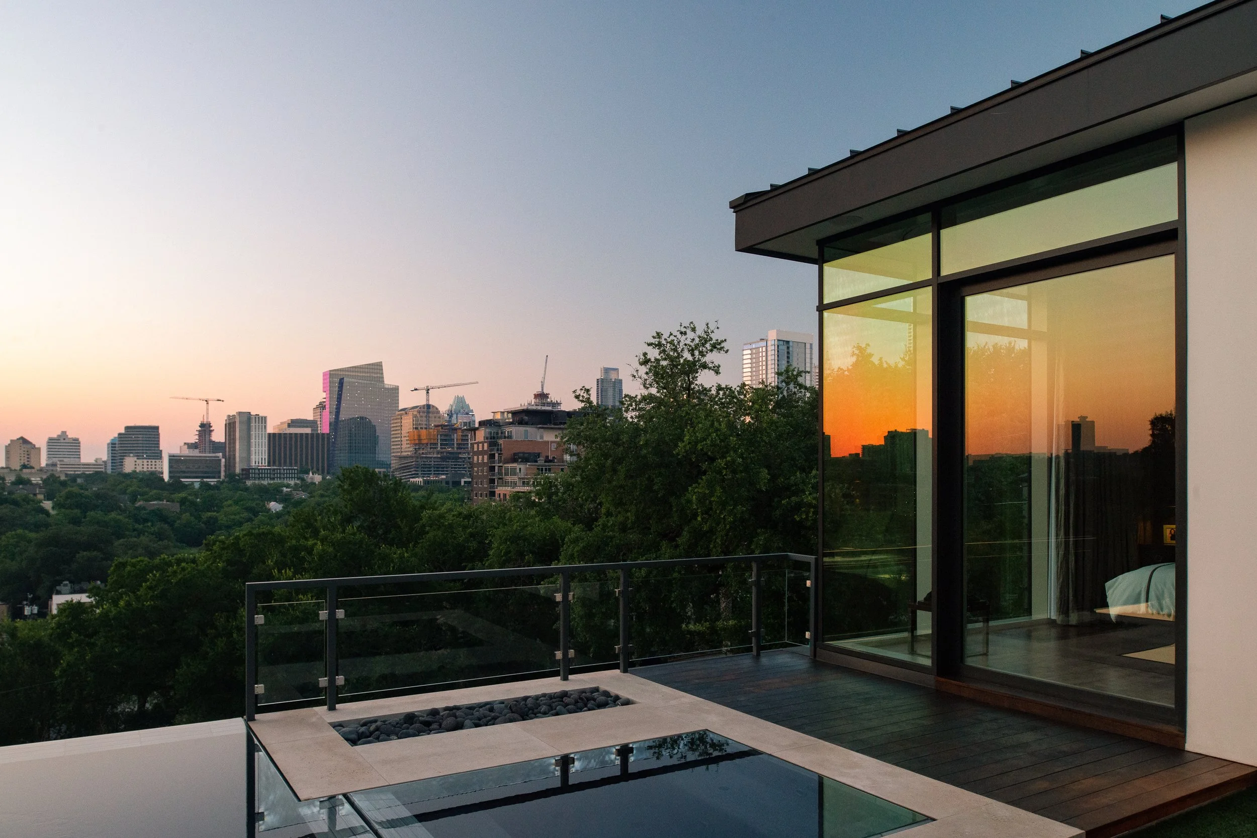
LaRue's material strategy makes this work. The front uses Boral siding that mimics the original exterior, with a reconstructed hip roof and wrap-around porch that sits comfortably alongside the remaining historic homes on West 10th Street. The back is a different world — floor-to-ceiling glass walls, stucco and metal panels, and a negative-edge pool that seems to float above the city. Teak decking ties the two halves together across the porches and terrace. And the painted blue soffit above the front porch is a deliberate nod to Clarksville's roots as one of the oldest post-Civil War freedmen's settlements west of the Mississippi.
From a photography standpoint, this duality is the whole story. The challenge isn't choosing between the historic front or the modern back — it's finding the frames that show how one becomes the other. The transition happens in the entry hall, where rich shiplap paneling and art rails give way to open, light-filled modern spaces. Doors to the original bedrooms and office are completely concealed in the walls, so the procession from old to new feels almost cinematic — you walk through what feels like a carefully restored traditional home and then the space opens unexpectedly to glass, light, and a panoramic view of Austin's skyline.
A House That Turned Sideways
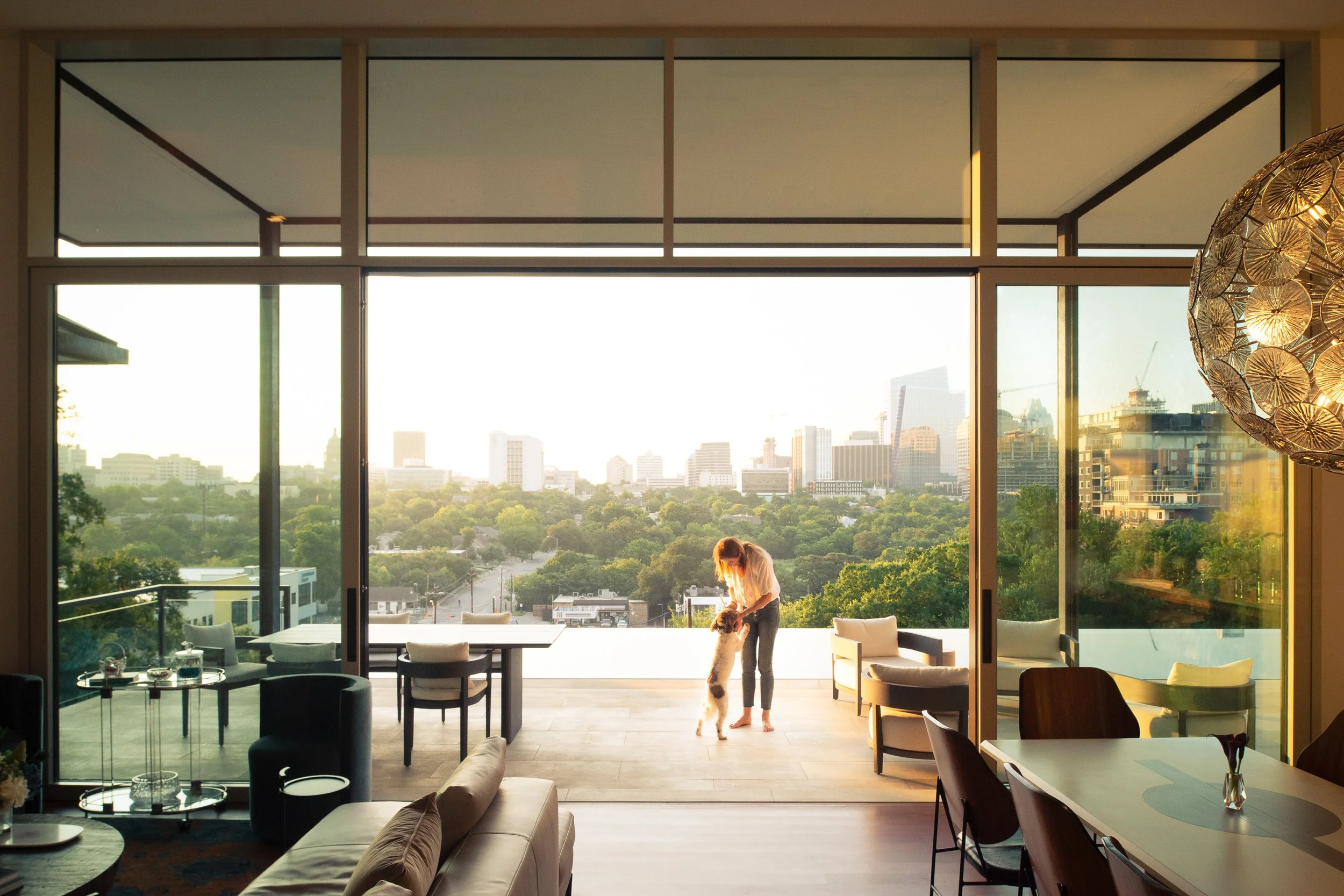
One of the most compelling architectural moves here is something you have to understand spatially to appreciate: the renovation essentially reoriented the house. The original bungalow faced the street, as bungalows do. The spectacular eastern views of downtown — the Capitol dome, the towers along Congress Avenue, the ever-changing skyline — were only visible from a side porch. LaRue turned the living spaces to face those views directly. The open-plan living, dining, and kitchen area is now organized around floor-to-ceiling glass walls that frame the city.
This reorientation created the photograph I kept coming back to during the shoot. Standing inside the main living space, looking east through ten-foot-tall sliding doors and four-foot transoms, with the infinity pool in the middle ground and the Austin skyline beyond — that's a three-layer image that tells you everything about what LaRue accomplished. You're standing in a hundred-year-old neighborhood, inside a house whose bones are more than a century old, looking through contemporary glass at a 21st-century city. Past, present, and future in a single frame.
The structural engineering required to achieve those views is worth noting. Steinman Luevano Structures designed a system that eliminates the large headers typically needed above expansive glass openings. The soffit lifts to further expand the view, and a clerestory window wraps the corner at the kitchen, pulling southern light deep into the space. Loewen Windows and Doors fabricated the timber-frame curtain wall system that makes the seamless indoor-outdoor connection possible. These are the kinds of technical details that don't announce themselves in a photograph but define the quality of the space you're looking at. When the structure disappears, the view takes over.
The Site
Clarksville sits just west of downtown Austin, flanking Lamar Boulevard between West 5th and West 12th Streets. It's one of the city's most historically significant neighborhoods — established in the 1870s as a freedmen's community by Charles Clark, a former enslaved person. The houses that remain from Clarksville's early decades are increasingly rare. New construction and renovation have transformed the neighborhood over the past twenty years, but the best projects — and this is one of them — find a way to honor what was there before.
The lot itself is steep. The original pier-and-beam house sat nine feet off the ground at its lowest point, and the clay-heavy soil added structural complexity to everything the team planned — the addition, the pool, the floor-to-ceiling windows. LaRue and Foursquare Builders navigated these constraints with care, tucking a garage under one end of the house and an exercise room under the other, connected by two sets of stairs to the main living level above. The result is a 3,900-square-foot home that reads as modest from the street but reveals its full scale only as you move through it and down the hill.
![placeholder - exterior showing the modern rear addition stepping down the hillside]
Details That Earn Their Place
The stairwell walls are lined with laminated Life magazine covers retrieved from the original basement. It's the kind of detail that could feel gimmicky in the wrong hands, but here it works — a quiet celebration of the house's endurance through decades of American life. The custom wine display that shields the kitchen-to-garage stairs is another moment where function and craft align without calling attention to themselves.
Throughout the house, the interior design by Love County Design complements LaRue's architectural restraint. The material palette stays quiet — warm woods, neutral tones, moments of the same deep blue that appears on the front porch soffit. The landscape design by David Wilson Garden Design extends the indoor-outdoor relationship that defines the project. Nothing competes. Everything serves the experience of moving through the space.
For architectural photography, restraint like this is a gift. When the design team has exercised discipline, the photographer can too. I didn't need to dramatize this house. I needed to show it clearly — how the light works, how the spaces sequence, how the old and new coexist. The images that result from that kind of approach tend to be the ones that last.
Why This Project Matters
The Clarksville Residence was featured on the 2021 AIA Austin Homes Tour and has been published in The Wall Street Journal, Architect Magazine, Tribeza, Austin Home, the Austin American-Statesman, CultureMap Austin, and PaperCity, among others. That publication record reflects something important about the project: it resonates with different audiences for different reasons. Architecture critics respond to the formal strategy. Lifestyle editors respond to the views and the entertaining spaces. Local media respond to the neighborhood story. The images serve all of those narratives because the architecture itself supports multiple readings.
For LaRue Architects, this project represents a body of work that spans more than three decades in Austin. The firm has built over 400 private residences and has developed a Hill Country Contemporary vocabulary that is distinctly their own. The Clarksville Residence sits at a particular point in that evolution — a project where the firm's modernist instincts had to negotiate with existing conditions, existing history, and existing meaning. The result is one of the most compelling historic renovations in Austin.
This is the kind of project that reinforces something I tell architects and designers regularly: your best projects deserve images that will represent them for years. The Clarksville Residence was completed several years ago. It continues to appear in award submissions, firm portfolios, press features, and social media. The images don't expire because the architecture doesn't expire. That's the return on investing in photography that takes the work seriously.
Project Details Architecture: LaRue Architects — James LaRue, Emily Haydon Builder: Foursquare Builders Interior Design: Love County Design Structural Engineer: Steinman Luevano Structures Windows: Loewen Windows and Doors Landscape: David Wilson Garden Design Location: Clarksville, Austin, Texas Original Construction: 1915 Renovation Completed: 2021 Size: 3,900 square feet Photography: Tobin Davies
Photographing the Lean on Me House | Award-Winning Hill Country Architecture | Tobin Davies
Some houses sit on their site. The Lean on Me House grows out of it — stepping down more than fifty feet of hillside in terraced volumes that make the topography feel like a collaborator rather than a constraint.
Designed by Francisco Arrendondo and Alicia Pierce of North Arrow Studio, this 3,030-square-foot residence in Austin's Barton Creek Habitat Preserve was completed in 2021 and has since earned a place on the 2021 AIA Austin Homes Tour, features in Tribeza and PaperCity, and the 2025 Austin Home Best Home in the Hill Country award. It was also recently listed for private sale through Robb Report — one of the rare Austin residences to earn that distinction.
I had the opportunity to photograph this house, and the experience reinforced something I believe about this work: the best architectural photography doesn't just document a building. It reveals the ideas behind it.
A House That Follows the Land
The Barton Creek Habitat Preserve is a 4,100-acre protected green space on Austin's western edge — home to endangered songbirds, rolling terrain, and some of the most dramatic Hill Country topography you'll find inside city limits. The lot itself rises steeply from street level, with a large drainage easement further complicating where a house could actually land.
North Arrow Studio's response was to let the hill dictate the architecture. Rather than fighting the grade with retaining walls or a massive pad, they stacked the program in terraced volumes that step down the slope. The result is a home that reads as intimate and pedestrian-scaled from the street, then unfolds dramatically as you move through it — each level revealing a new relationship to the landscape below.
The steep grade became the driving force behind the design. From the street to the back of the property, it rises more than fifty feet.
For photography, this kind of sectional complexity is a gift. Every vantage point tells a different story — the compressed entry sequence, the moment the space opens to the preserve, the layered volumes seen from below. The challenge is choosing which stories to tell and in what order.
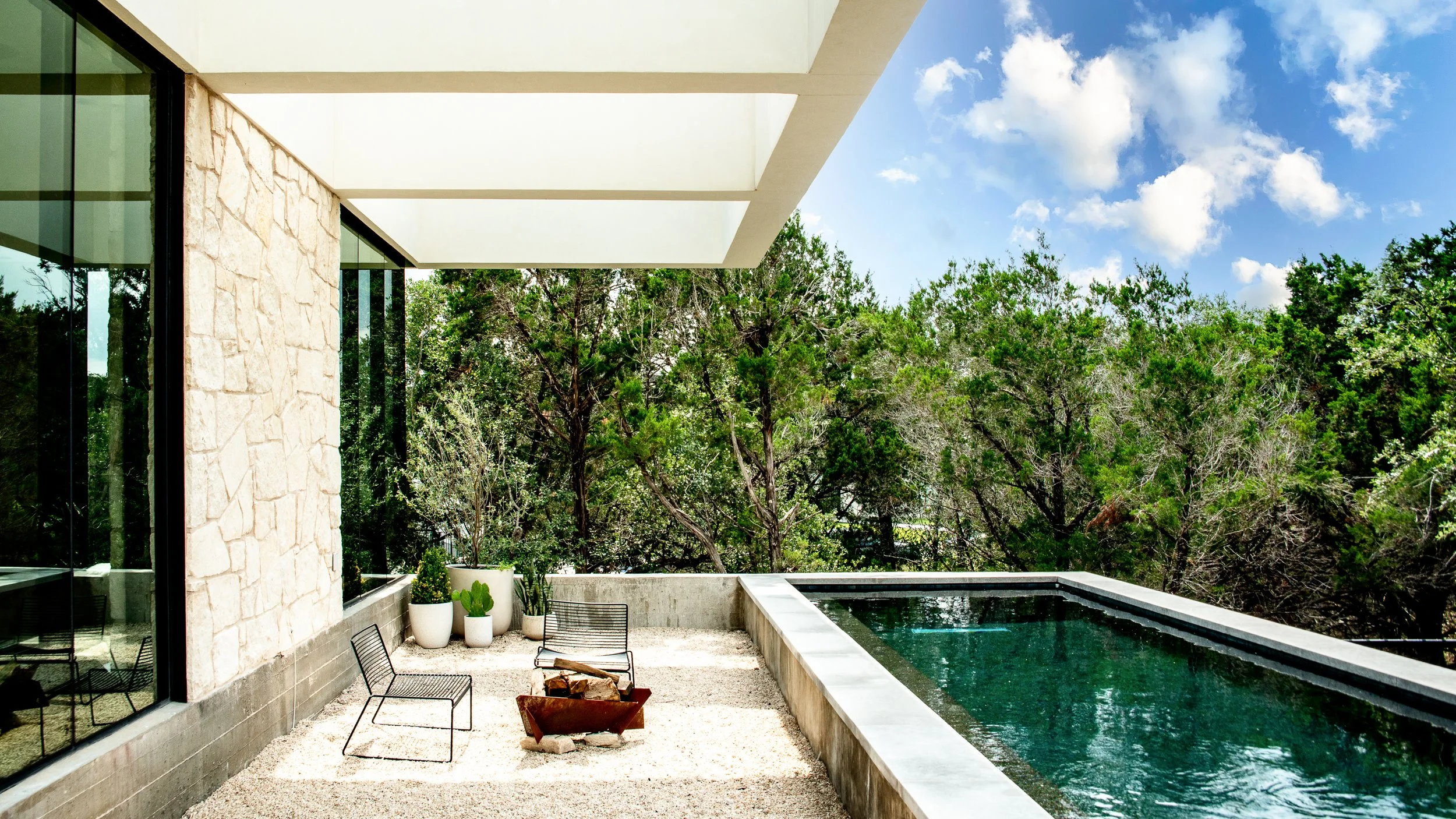
Material Honesty in the Hill Country
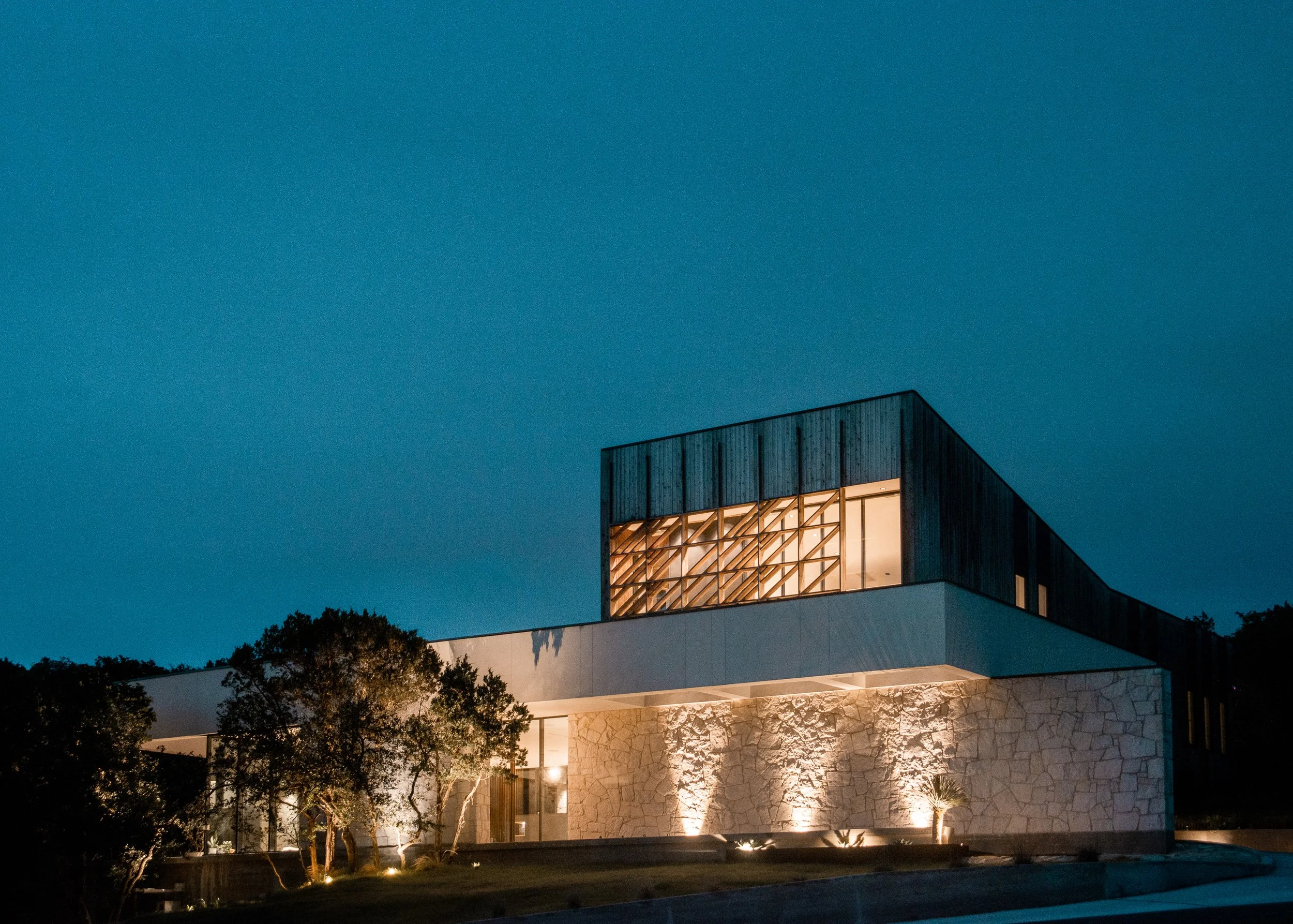
The material palette is restrained and deliberate: warm vertical cedar siding on the upper volume, native limestone below, and large expanses of glass in between. There's a striking glass "belly" carved into the transition between levels that houses a music room and meditation space — one of the home's most distinctive architectural moves. Custom angled glazing floods this interstitial space with light, and from the exterior it reads almost like the house is breathing.
Photographing material transitions like this requires careful attention to how light interacts with each surface at different times of day. Cedar reads warm and textured in morning sidelight but can flatten in harsh midday sun. Limestone picks up subtle color from the surrounding landscape. The glass belly needed to be shot at a moment when it was transparent enough to reveal the interior but still reflective enough to show the landscape — a narrow window that depends on time of day and sky conditions.
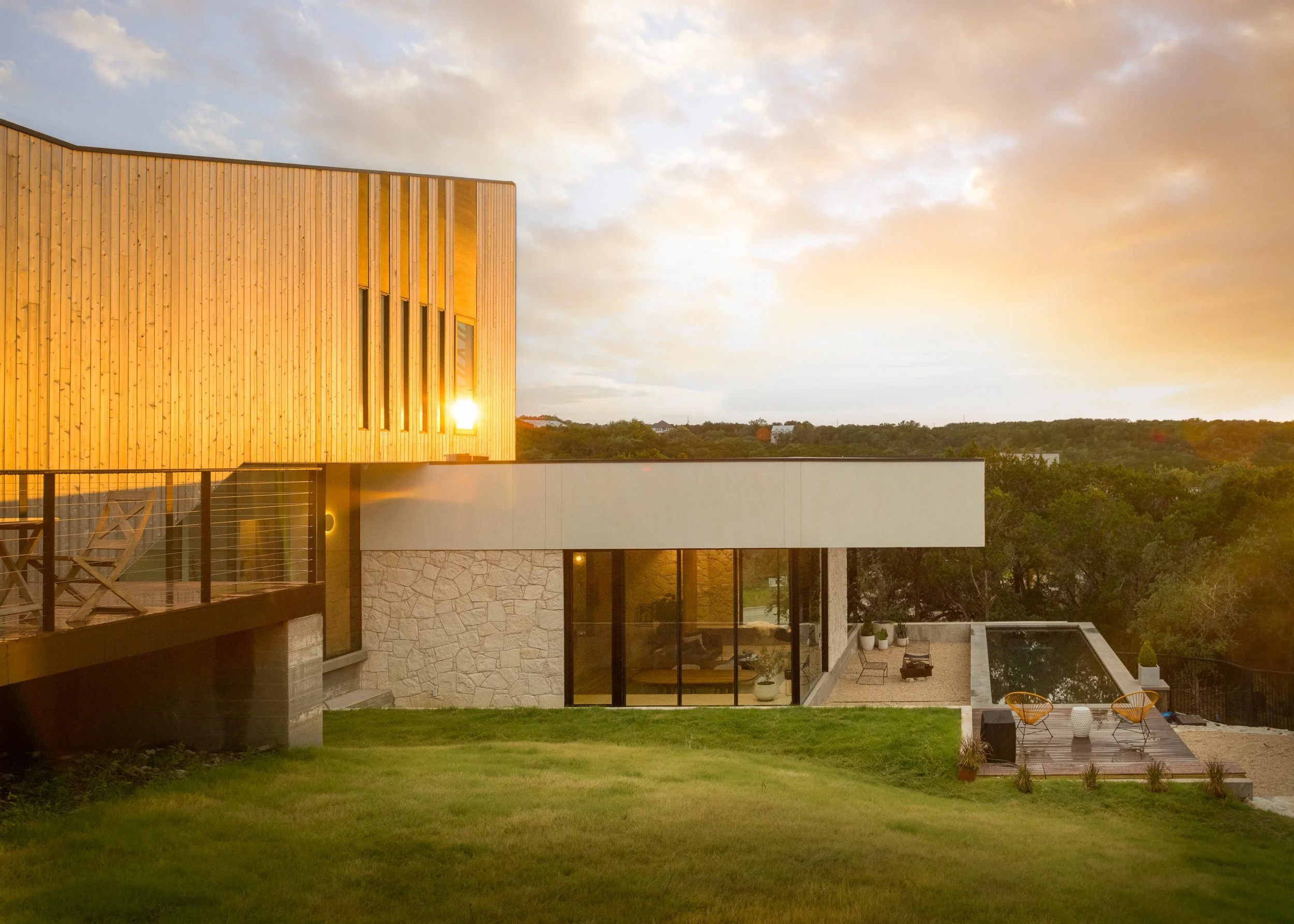
Indoor-Outdoor as Philosophy
Austin architecture has always engaged with the outdoors, but the Lean on Me House takes it further than most. A courtyard pool with cantilevered sky frames extends the living spaces outside. A rooftop deck offers panoramic views of the preserve. A detached casita with guest bedroom and tree-shaded cabana creates a secondary outdoor living zone. Solar panels and rainwater harvesting round out the sustainability story.
From a photography standpoint, this kind of permeability means the exterior is never just backdrop — it's always in conversation with the interior. Framing a shot through the living room toward the pool courtyard and the preserve beyond is really about capturing three layers of space in a single image. The architecture asks you to see through it, and the photography needs to honor that transparency.
Why This Work Matters
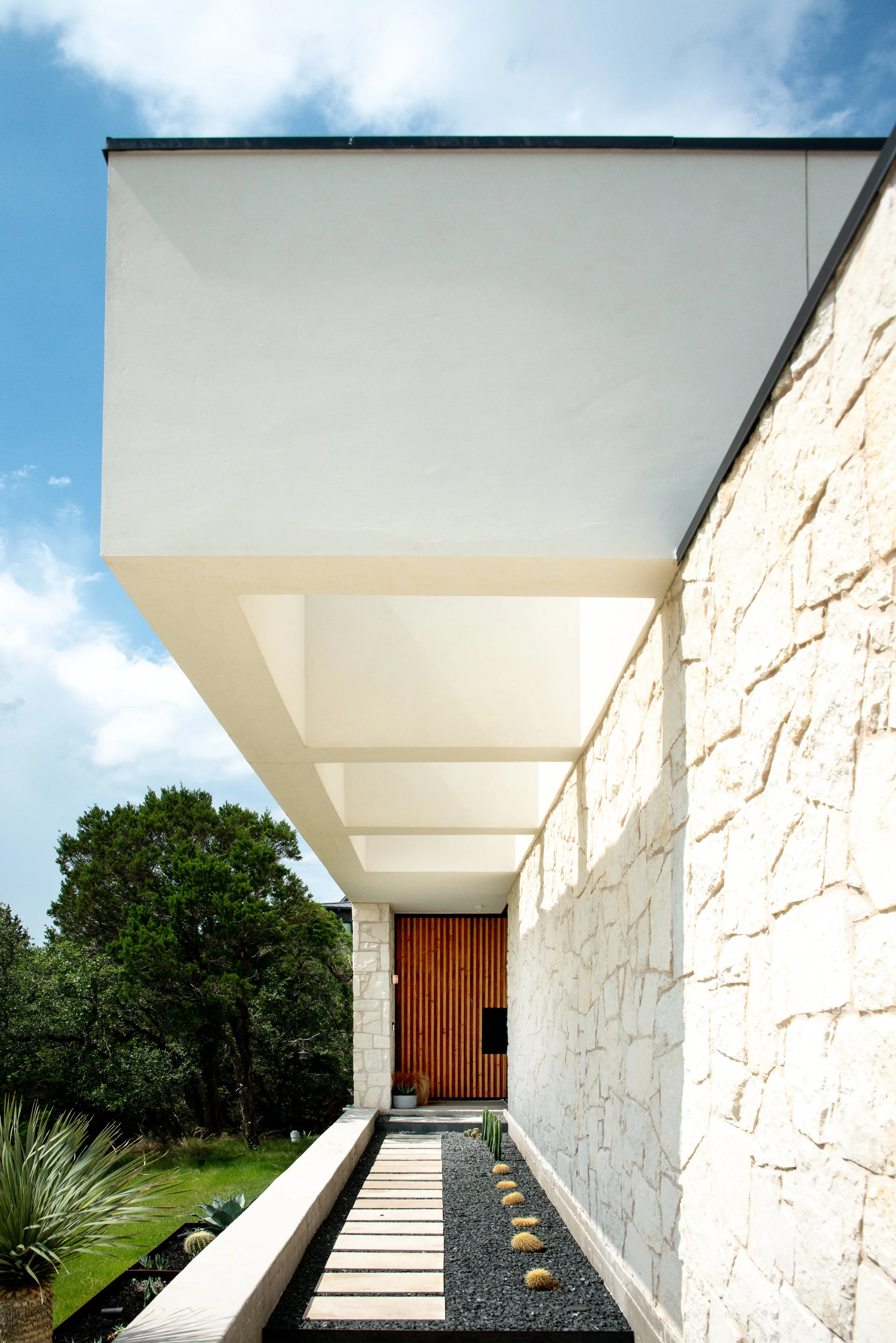
The Lean on Me House has had a remarkable trajectory — from completion in 2021 through the AIA Austin Homes Tour, features in Tribeza and other publications, to winning Austin Home's Best Home in the Hill Country four years later. That longevity speaks to the strength of the design. Good architecture doesn't age out.
For architects, builders, and designers, this project is a reminder of something I see in my work every day: the images that represent your projects will outlast almost every other form of marketing you invest in. They'll appear in award submissions, publications, websites, and social media for years — sometimes decades.
That's the return on investment in architectural photography. Not a single shoot for a single purpose, but a visual asset that compounds in value every time it's used.
Project Details Architecture: North Arrow Studio Location: Barton Creek Habitat Preserve, Austin TX Completed: 2021 Builder: Foresite Recognition: Austin Home 2025 Best Home in the Hill Country.
Have a project that deserves to be seen? I work with architects, builders, and designers to create images that earn publications, win awards, and build portfolios. Let's talk about yours. tobindavies.com/contact
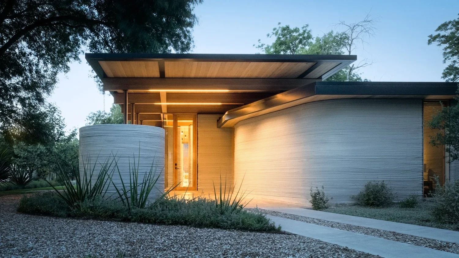
Inside House Zero: Photographing the World's Most Celebrated 3D-Printed Home
Some buildings ask to be photographed differently. House Zero is one of them.
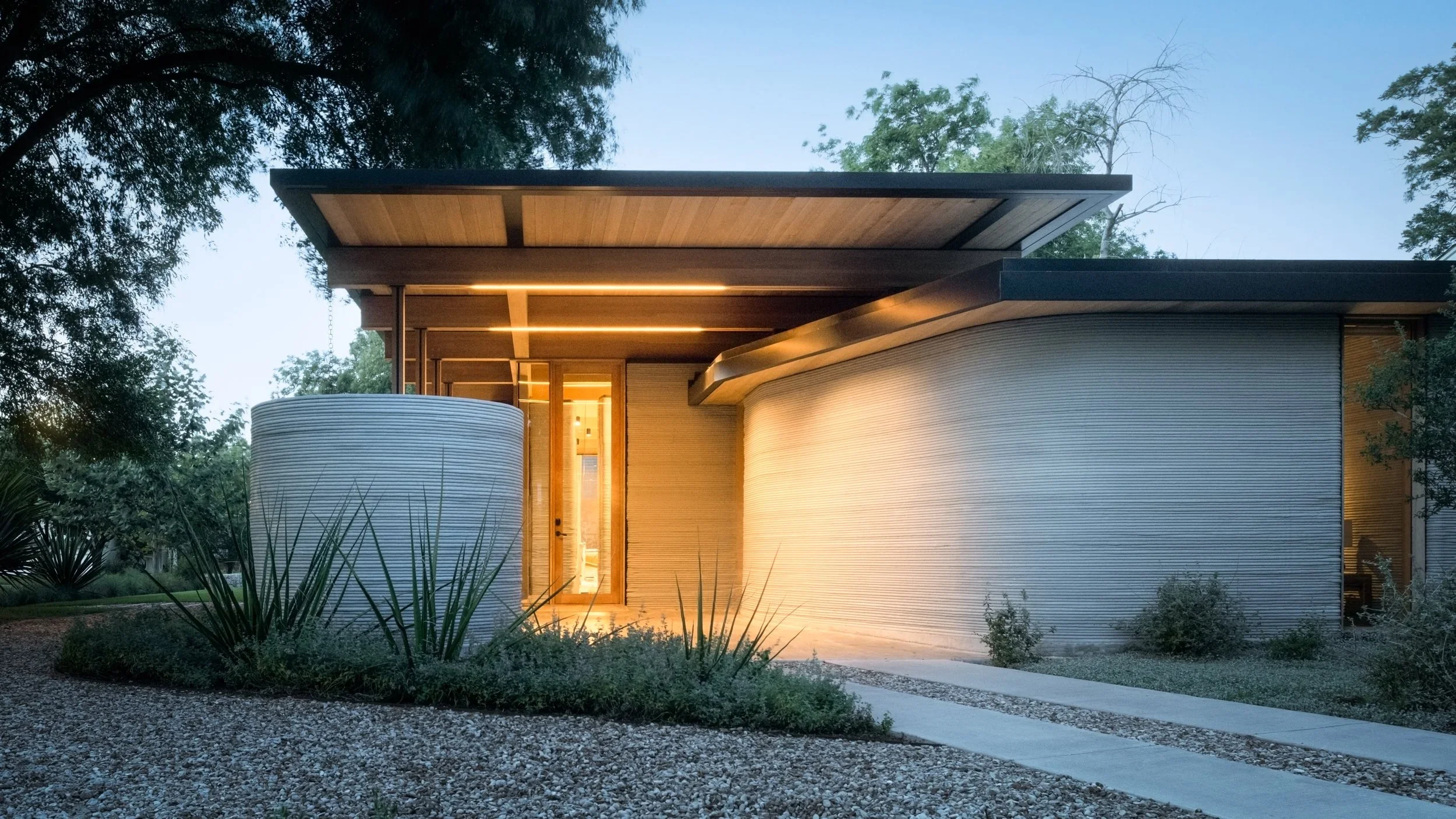
When ICON and Lake|Flato Architects completed their collaboration in East Austin in the spring of 2022 — timed deliberately to coincide with SXSW — the architectural world took notice immediately. A 2,000-square-foot, three-bedroom home with walls made of Lavacrete, a proprietary cementitious material extruded by a 9,500-pound robotic printer over the course of ten days. Curved surfaces, no hard corners, clerestory windows angled to capture the soft eastern light of an Austin morning. By the end of that year, TIME magazine had named it one of the 200 Best Inventions of 2022. Fast Company followed with an Innovation by Design award. The Texas Society of Architects added a TxA Design Award. Two Architizer A+ Awards after that.

What makes a project like this challenging to photograph isn't its novelty — it's that novelty can overwhelm. The temptation is to lead with the technology. The ribbed texture of the Lavacrete walls. The way the printing layers stack visibly, like geological strata. Those details are real and worth showing. But the architecture that Lake|Flato designed here isn't a technology demonstration. It's a home — mid-century modern in spirit, biophilic in intention, rooted in the kind of regional sensibility that Lake|Flato has practiced since 1984.

The framing I kept returning to during this project: what a really good mid-century ranch house wants to be, freed by new technology from the constraints that conventional construction imposes. That became the photographic mandate. Shoot House Zero the way you'd shoot any exceptional piece of architecture — as a place where light, material, and proportion have been considered with care — and let the construction story surface through the images rather than dominate them.
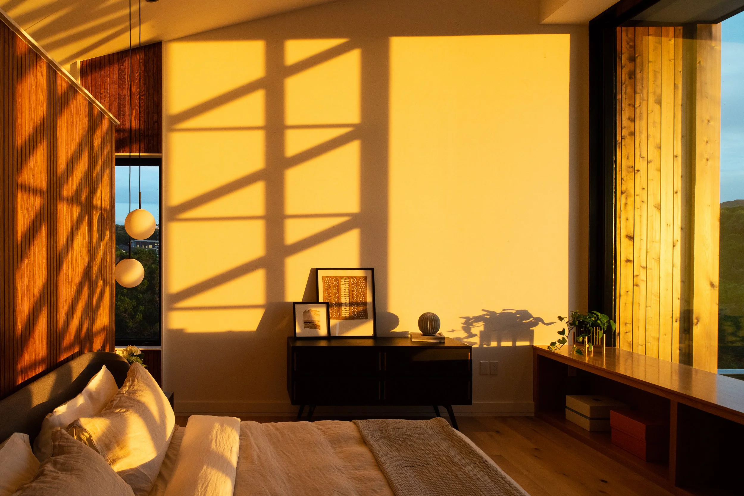
The eastern-facing clerestory windows were the first thing I studied on site. Lake|Flato placed them to minimize the need for electric light during daylight hours, and the quality of what they admit into the living room at certain times of morning is extraordinary — diffuse, directional, warm against the cool Lavacrete. The flat roof with its cantilevered awnings creates a geometry that rewards a long lens from the street. And the rounded corners that ICON's Vulcan printing system makes possible — corners that conventional framing and drywall simply cannot achieve — create soft transitions between interior spaces that read on camera as something genuinely new. Not futuristic. Just quietly different from every other house you've ever photographed.
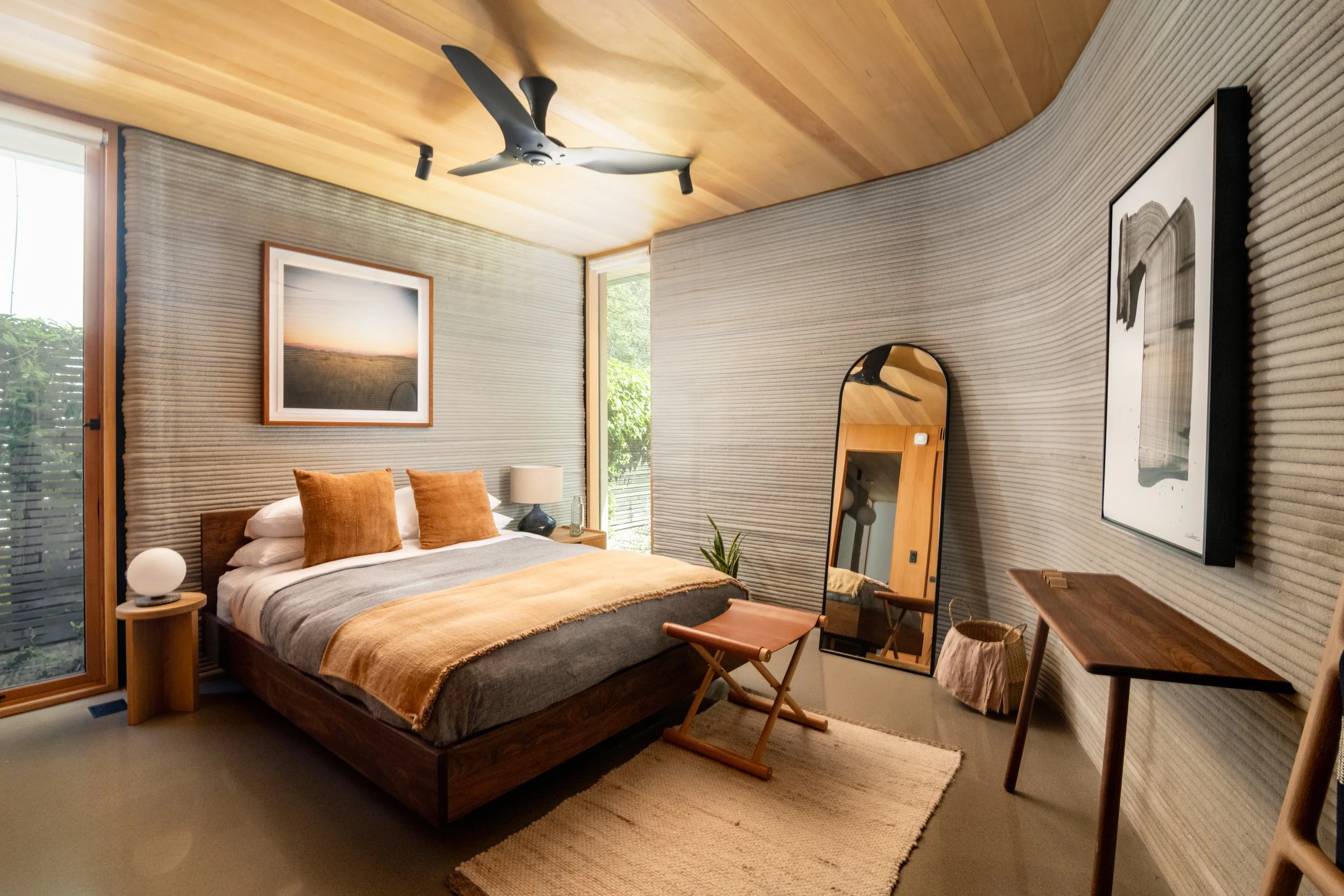
The site itself shaped the approach. House Zero sits at 1700 Riverview Street in East Austin's East Cesar Chavez neighborhood, where ICON used it for several years as a living showcase before bringing it to market. The surrounding context is modest — a working-class neighborhood mid-gentrification, a mix of original bungalows and new infill. That contrast is part of the story. The house doesn't try to disappear into its surroundings. It doesn't try to dominate them either. It occupies its lot with a confidence that comes from knowing exactly what it is.
Lake|Flato, the San Antonio and Austin-based firm that designed it, received the AIA's Firm of the Year Award and has been recognized by ARCHITECT Magazine as the top-ranked firm in the United States. Their practice is built on a deep reading of climate, site, and regional material culture — and House Zero, despite its technological novelty, is a Lake|Flato building through and through. The curved walls track the sun. The overhangs are sized for the Texas latitude. The palette is restrained and rooted in the landscape. Photographing their work is a responsibility I take seriously, because their buildings reward the kind of attention that most photography rushes past.
House Zero is the kind of project that reorients your sense of what's possible — not just in construction, but in what architectural photography needs to do to keep up. The buildings are getting more interesting. The documentation has to match.
Photography by Tobin Davies. Architecture by Lake|Flato Architects. Construction technology by ICON.
Tobin Davies is an architectural photographer based in Austin, Texas, working with architects, interior designers, and developers across Texas and nationally. Available for new projects.
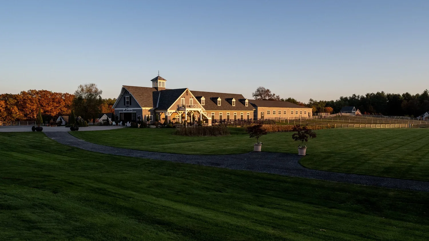
Photographing Bonterra Farm for Blackburn Architects: Equestrian Architecture on 100 Acres in New Hampshire
Most of the architecture I photograph is designed for people. Living rooms scaled to human comfort, kitchens oriented toward morning light, bedrooms that frame a view at eye level. The proportions, the materials, the way a space unfolds — it's all calibrated to how we move through and inhabit a building. Bonterra Farm is designed for horses. That distinction changes everything — how the architecture works, how light moves through it, and how I approached photographing it.
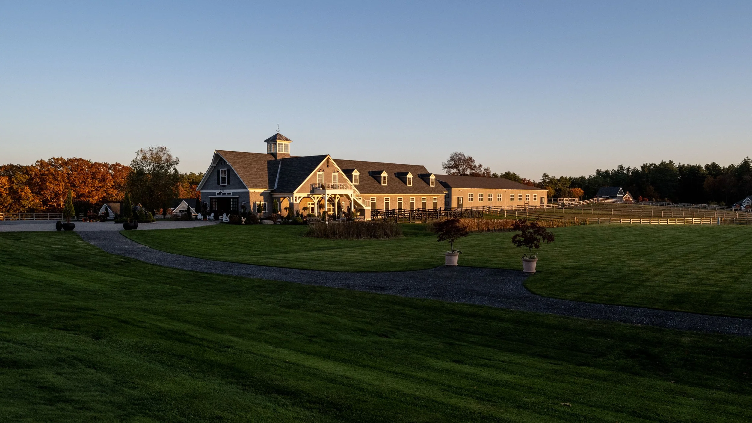
A Different Kind of Client
Blackburn Architects hired me to photograph Bonterra, and the farm's owner, Blythe Brown, hosted me for the day. It was one of those shoots where the context is as important as the architecture — you can't separate the buildings from the land they sit on, or the animals they were built to serve. Blackburn Architects, based in Washington, D.C., has been the world's leading equestrian architecture firm since 1983. Their founder, John Blackburn, is credited with fundamentally rethinking how barns are designed — pioneering an aerodynamic ventilation approach that prioritizes the health and safety of horses through natural airflow, strategic light, and careful orientation to the land. Their barns are known throughout the world, and they literally wrote the book on the subject — their monograph, American Equestrian Design, is the definitive reference. Bonterra is one of their most recognized projects. The distinctive shingled barns sit on wooded New England land and house a facility specializing in Friesian horses — powerful, elegant animals with a presence that matches the architecture built around them.
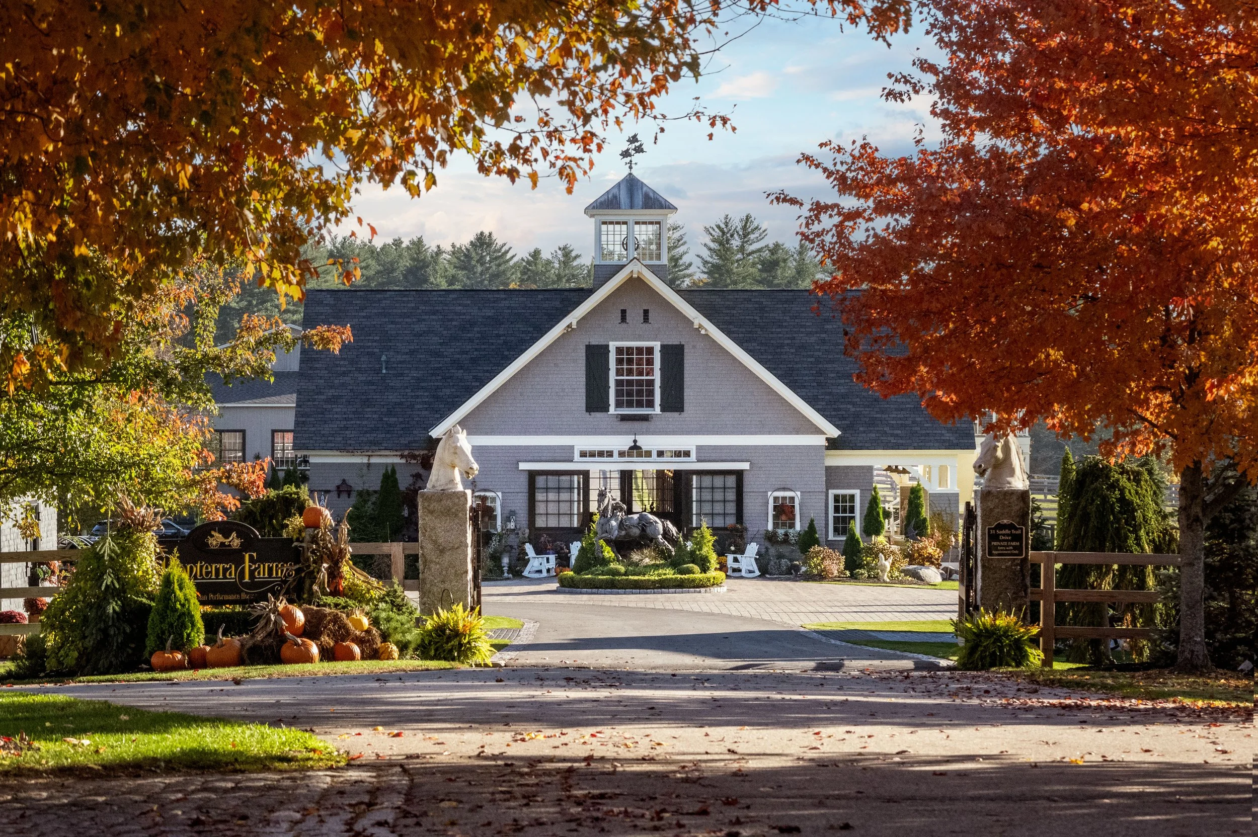
Architecture Designed for Animals
What makes equestrian architecture fascinating from a photography standpoint is that the design logic is completely different from residential work. In a home, you're thinking about human comfort, personal expression, and how a family lives. In a barn designed by Blackburn, you're thinking about airflow patterns, sightlines that keep horses calm, natural light that supports animal health, and proportions scaled to creatures that are far larger and more sensitive to their environment than we are. The ceilings are higher. The doors are wider. The windows are positioned not for a person standing at a kitchen counter but for cross-ventilation at horse height. The center aisle of a Blackburn barn is designed so that a horse standing inside feels like it's standing under a shade tree outdoors — open, breezy, calm. That's not a metaphor. That's the design intent. Photographing this means recalibrating your eye. The scale references are different. The human figure, which normally anchors an architectural photograph, becomes secondary. The "client" for this architecture is a 1,200-pound Friesian, and the success of the design is measured by whether that animal settles down when it walks in.
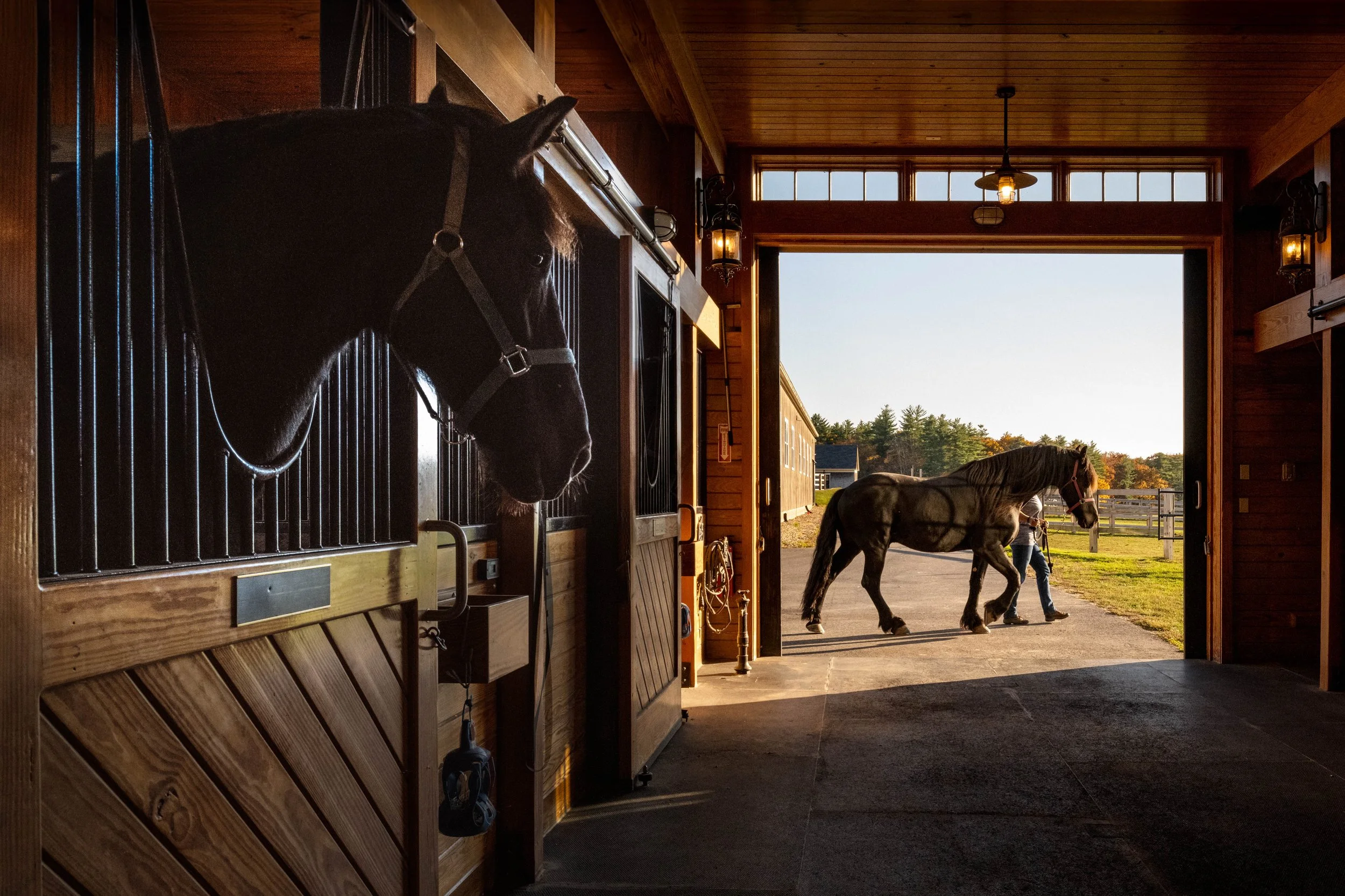
One of the things Blackburn is known for is how they use light. Their barns feature high roof lines, large windows, and cupolas that aren't just decorative — they're functional elements of a ventilation and daylighting system. At Bonterra, the light moves through the barns in a way that feels almost ecclesiastical. There's a quality to the interior illumination that reminded me of photographing spaces with clerestory windows — shafts of light entering from above, creating depth and atmosphere in what could otherwise be a utilitarian structure. The shingled exterior reads differently throughout the day too. New England light has a quality that's distinct from what I'm used to in Texas — softer, cooler, with a silvery tone that suits the weathered cedar shingles. By late afternoon, the barns take on a warm glow against the surrounding woods. The evening shot — light pouring from the barn windows into the New England dusk — is the kind of image that tells you everything about the relationship between the architecture and the landscape.
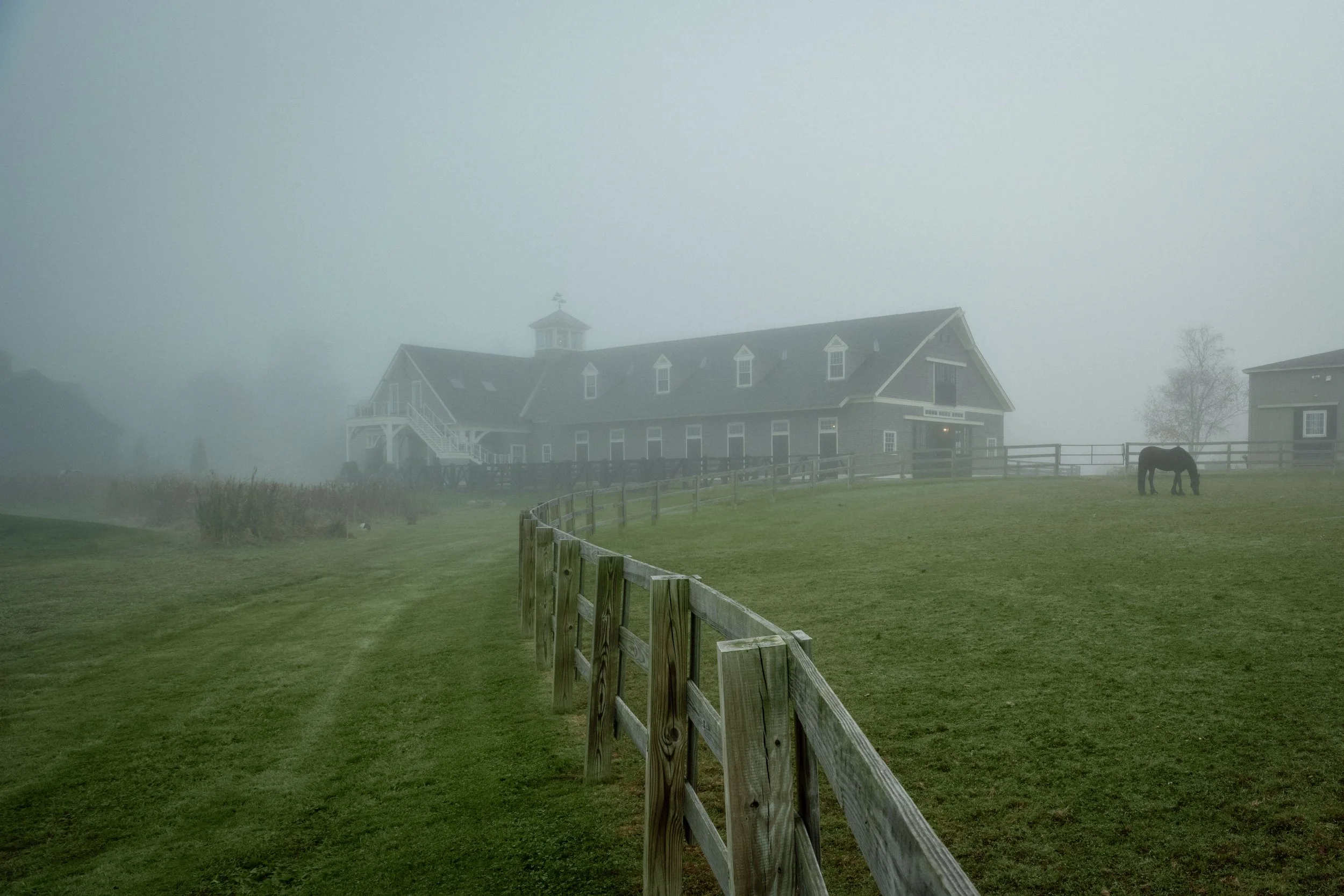
100 Acres of Context
Bonterra isn't just a barn. It's a full equestrian compound — barns, carriage house, paddocks, riding areas, and support structures spread across 100 acres of wooded land along the Cochecho River. Photographing a property at this scale means thinking about the relationship between structures and landscape in a way that's more like documenting a campus than a single building. Blythe Brown has built something remarkable here over two decades. The property has a sense of stewardship — of the land, the animals, and the architecture — that you feel immediately when you arrive. That's not something you can fake in a photograph, but it does come through. When the grounds are loved, when the buildings are maintained with care, when the animals are healthy and at ease — the camera picks up on all of it.
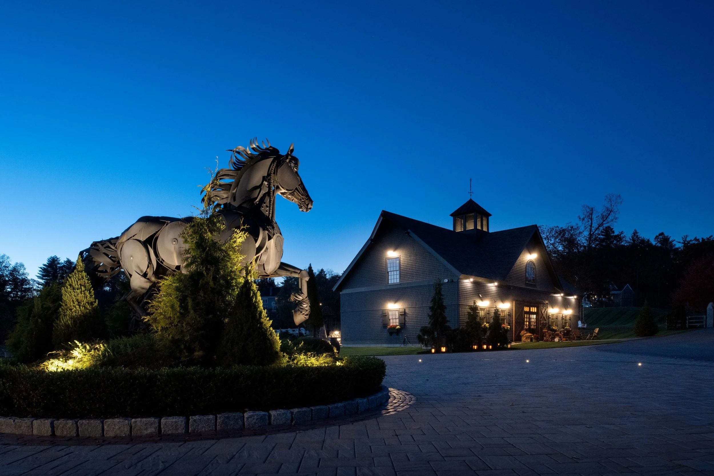
Why This Project Matters to Me
I photograph a lot of luxury residential work in Texas. Modern homes, clean lines, Hill Country limestone. I love that work and it's the core of what I do. But projects like Bonterra remind me why I got into architectural photography in the first place — because great architecture is great architecture, regardless of who (or what) it's designed for. When Blackburn Architects calls and asks you to fly to New Hampshire to photograph one of their most iconic projects, you say yes. Not just because of the prestige of the firm or the beauty of the property, but because the work itself demands something different from you as a photographer. Different scale, different light, different priorities. That's how you grow. The images from Bonterra have become some of the most-viewed work in my portfolio. I think that's because they surprise people. Visitors come to my site expecting Texas modernism and find these beautiful shingled barns glowing in New England twilight. It opens a conversation about what architectural photography can be — and that conversation has led to some of my most interesting commissions.
Project Details Architecture: Blackburn Architects, Washington, D.C. Location: Dover, New Hampshire Property: Bonterra Farm — 100-acre Friesian horse facility Owner: Blythe Brown Original Design: 2002 Photography: Commissioned by Blackburn Architects